BRAIN Magazine Cover Design
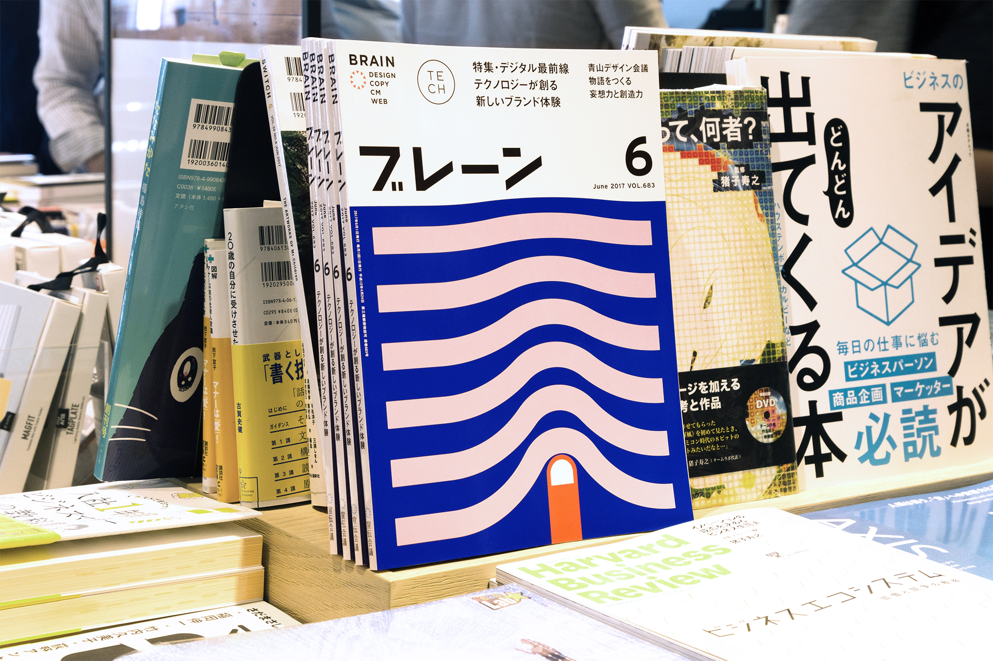
— One of the most prominent monthly Japanese trade magazines covering design and advertising reached out to W+K Design to create the cover for the May 2017 issue.
We were tasked with finding a way to express the idea of “creative addiction” and my artwork was chosen for the cover. For the final execution, I distilled my idea down to the simplest of forms that would be able to express all of the poking, digging, scratching, pulling, sniffing, looking, tasting, and discovering that happens during the creative process.
Role: Art Director, Designer, Illustrator, Production Designer
Motion Designer: Claire Kang
Design Director: Guy Featherstone

BRAIN Magazine Animation
— I created additional scenarios with the curious red finger to further explore my cover concept. The animation was used on magazine’s social channels.
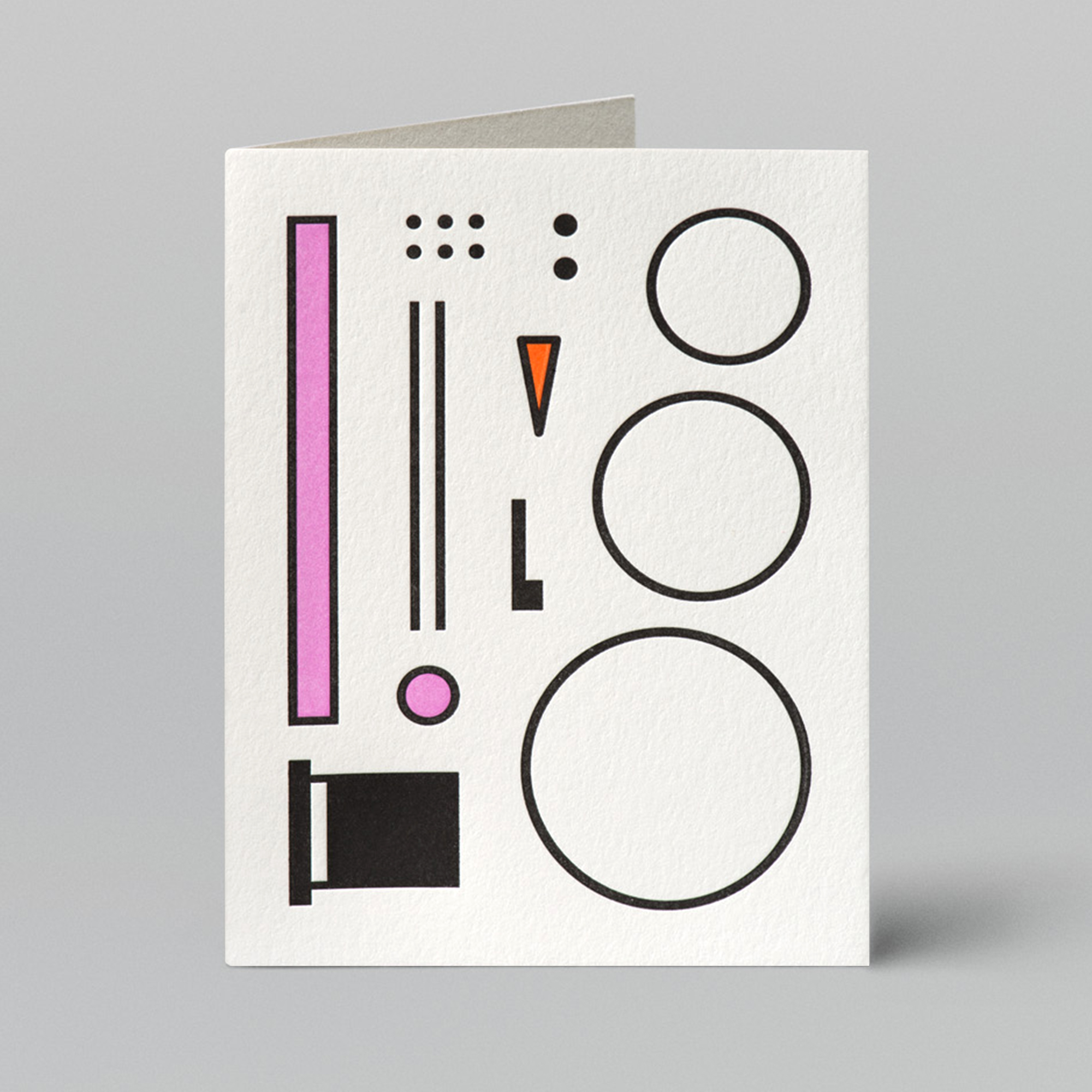
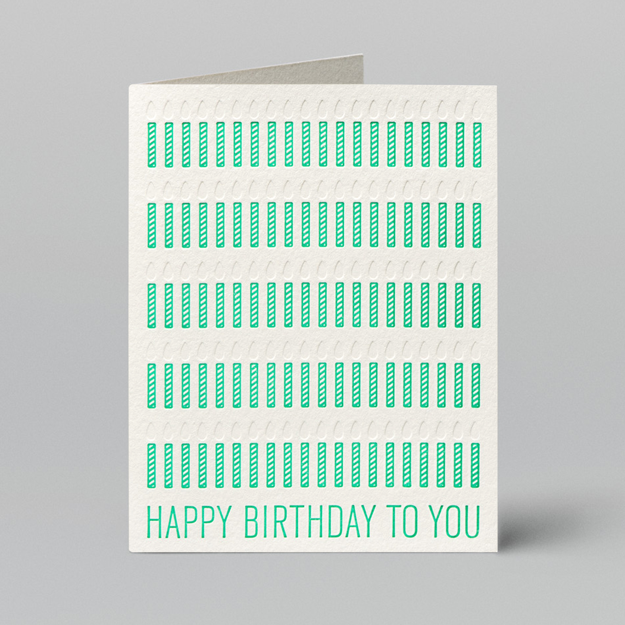
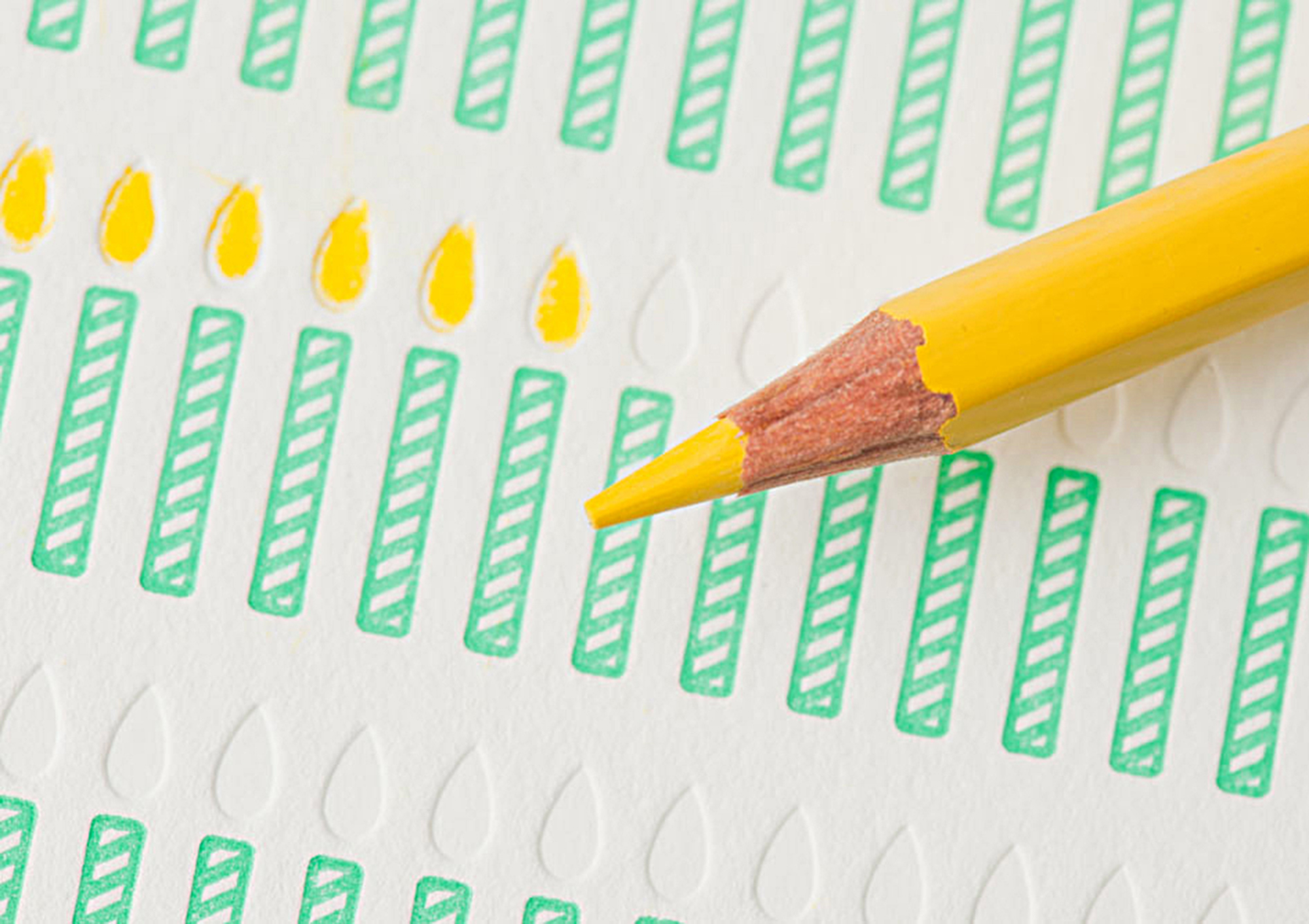
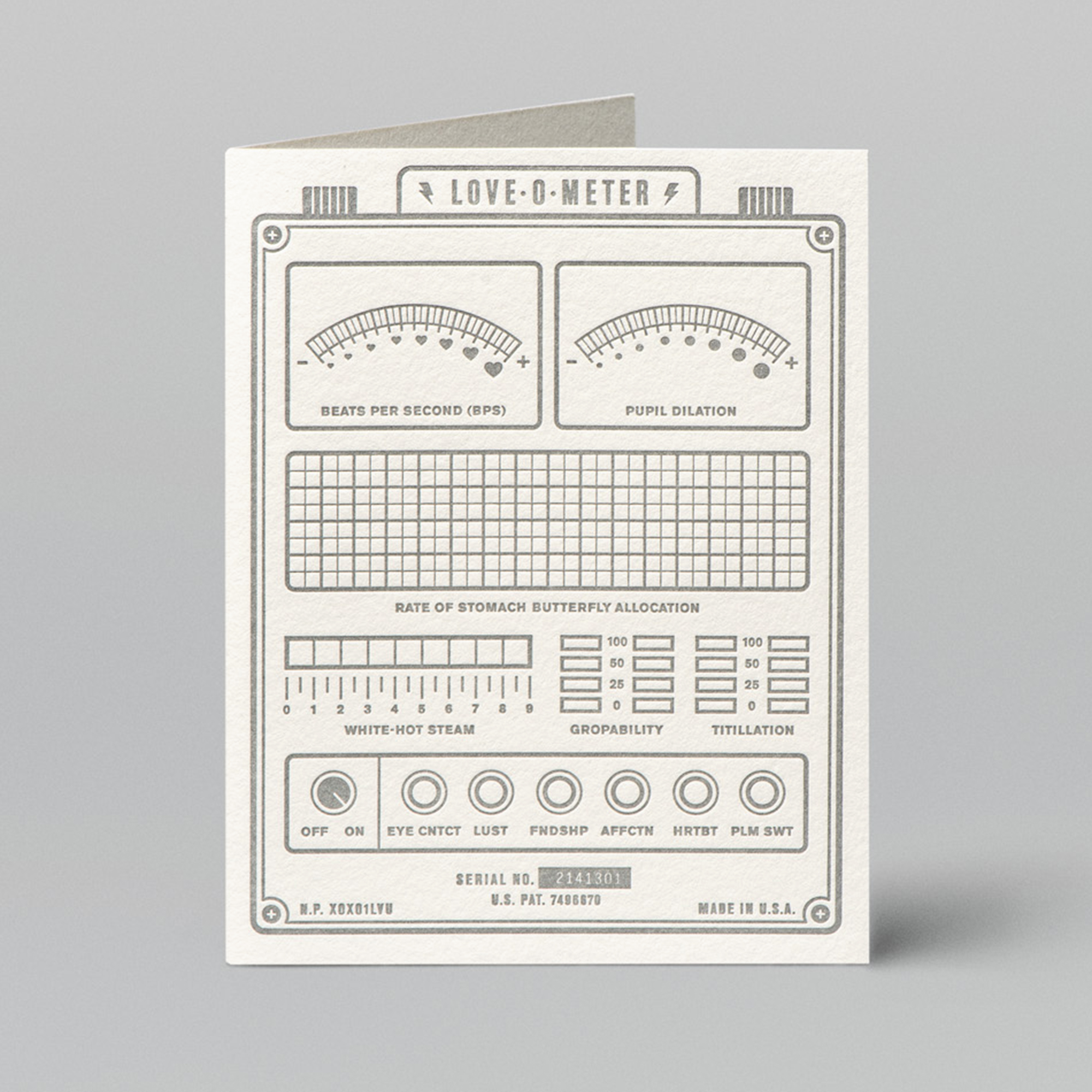
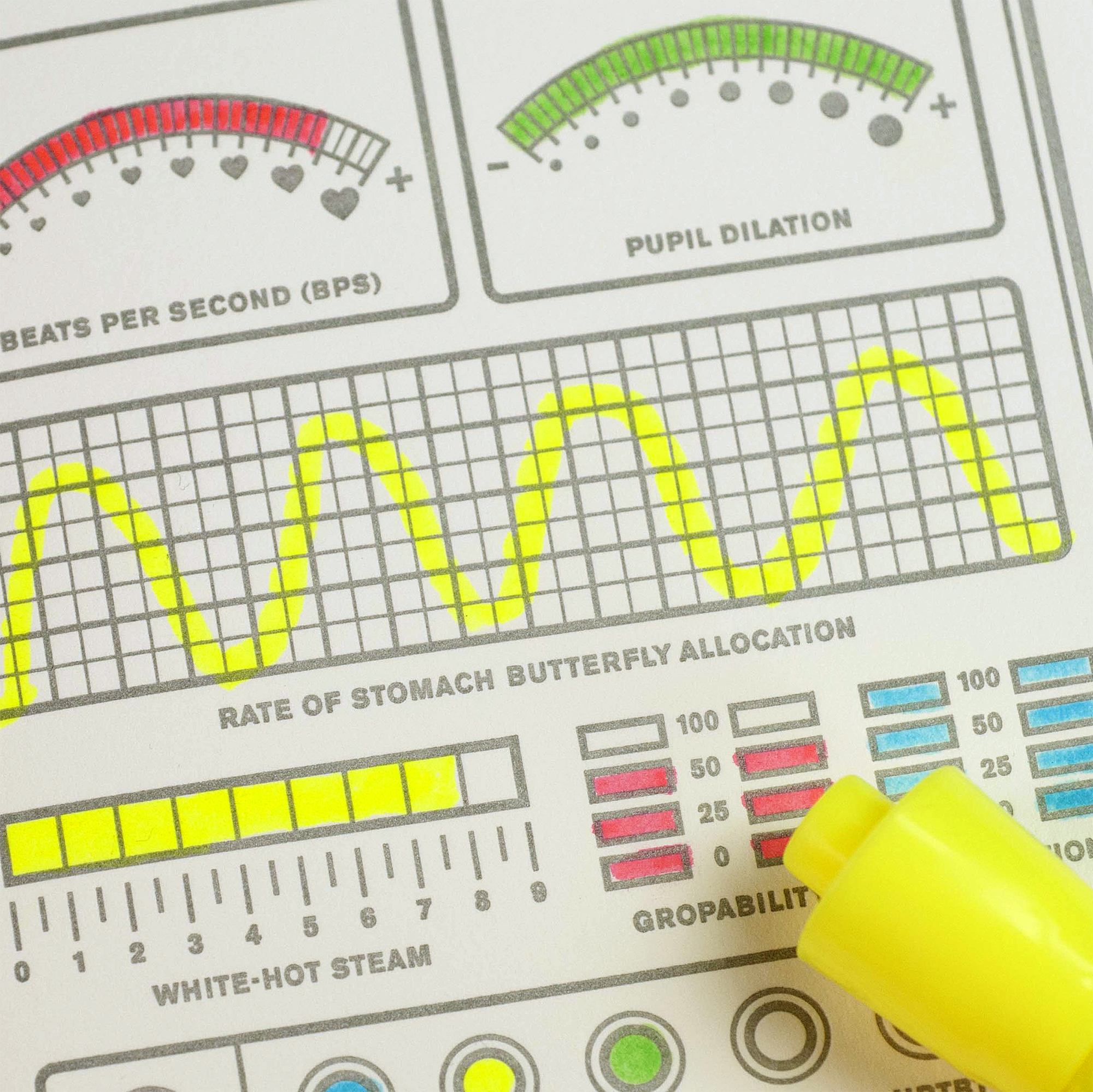
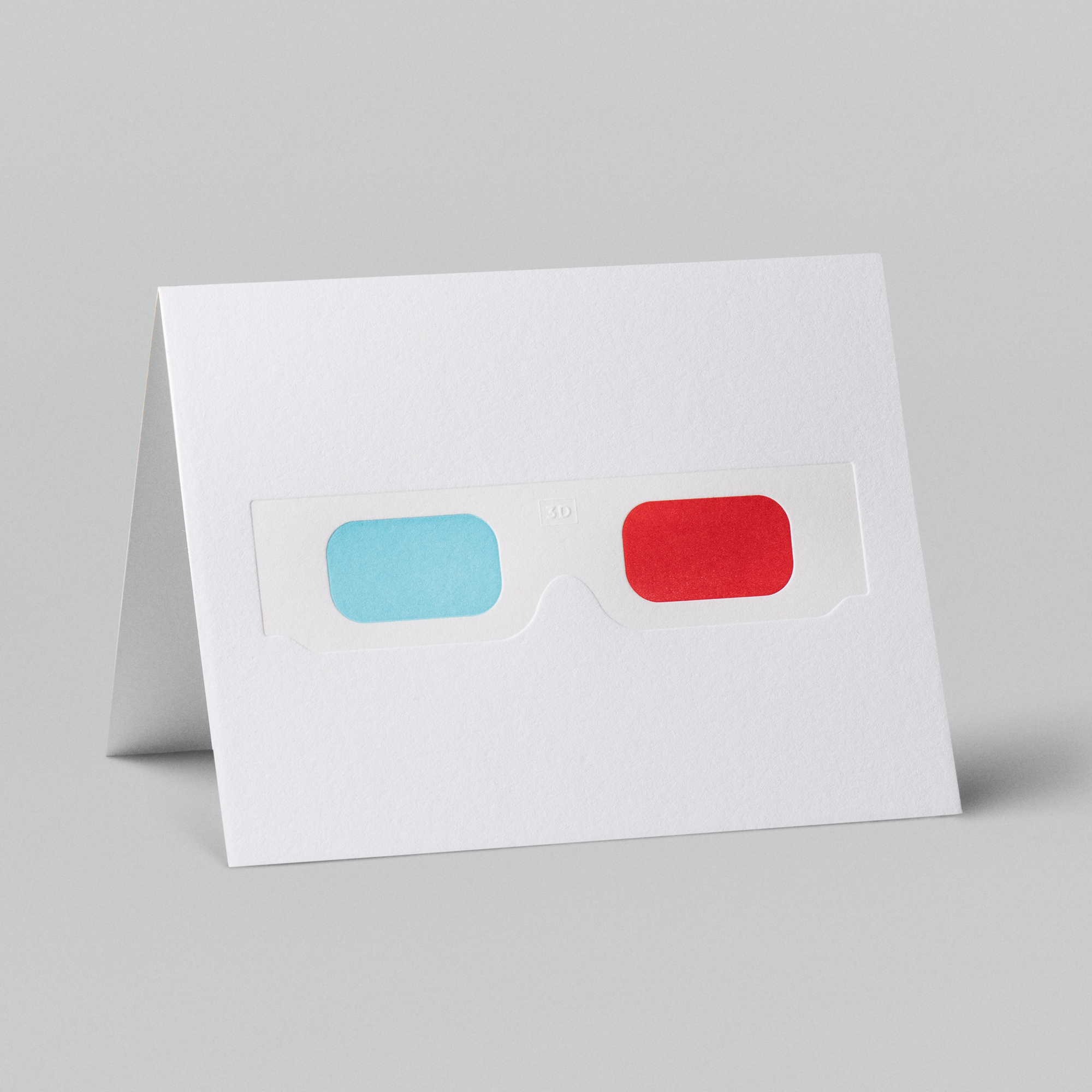
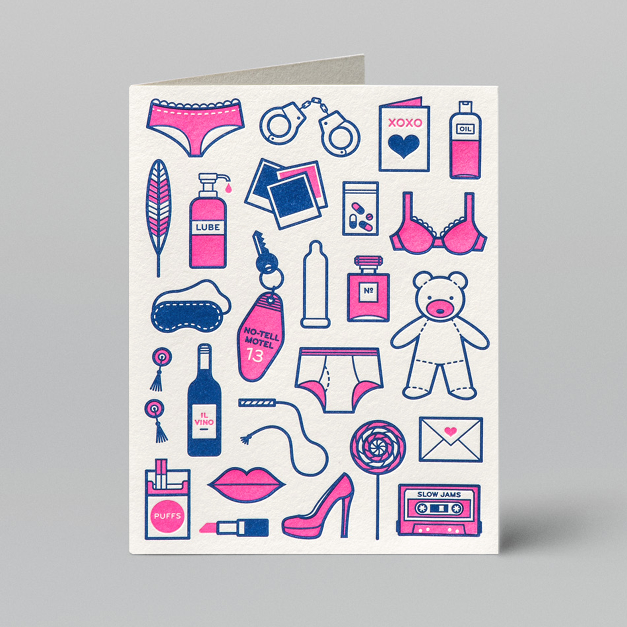
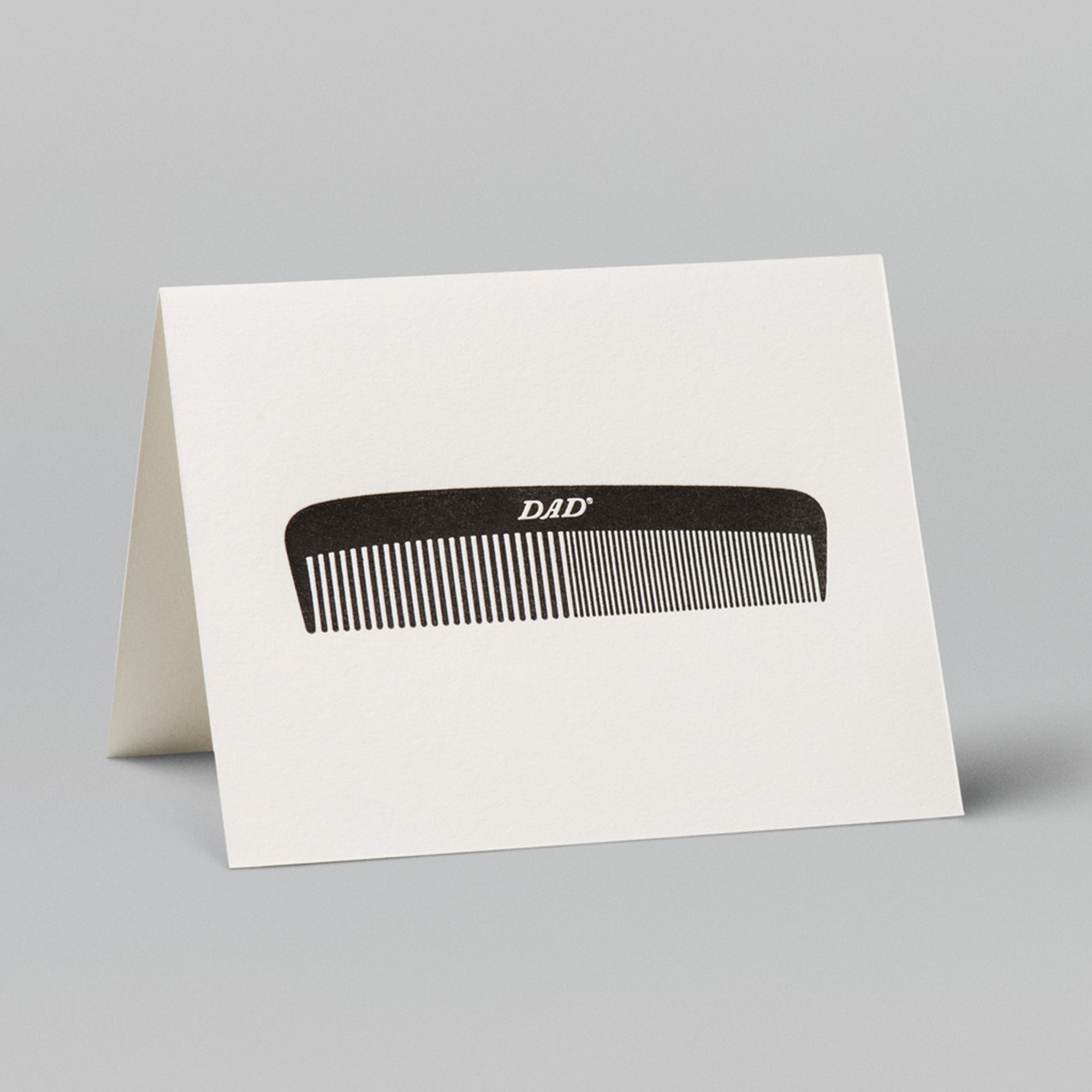
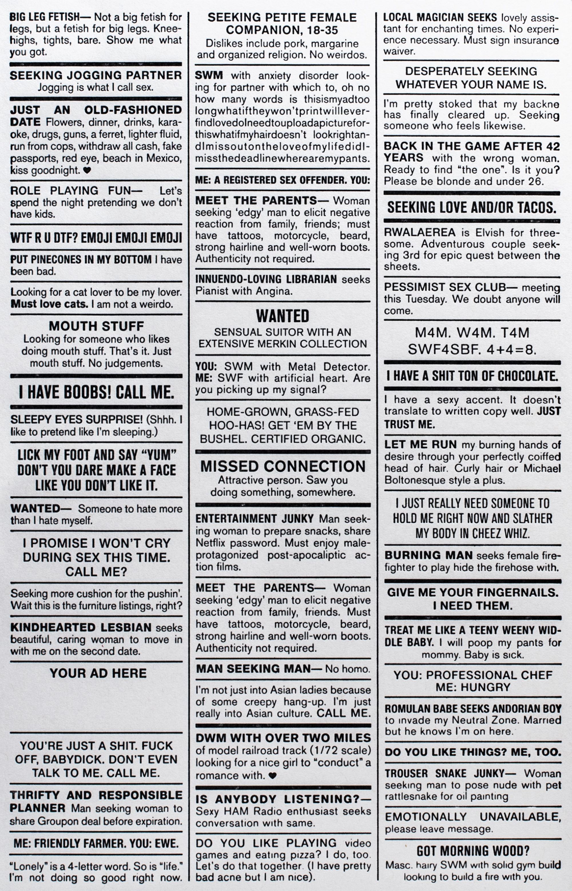
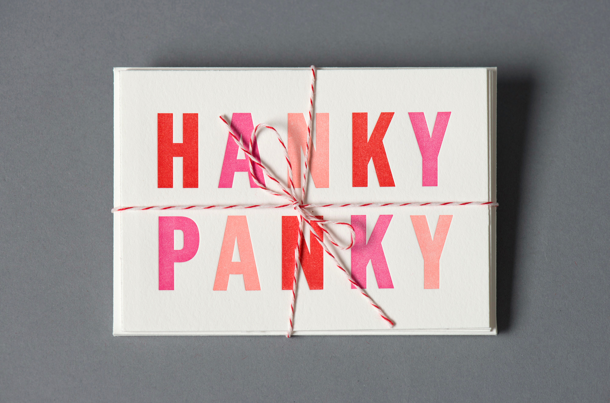
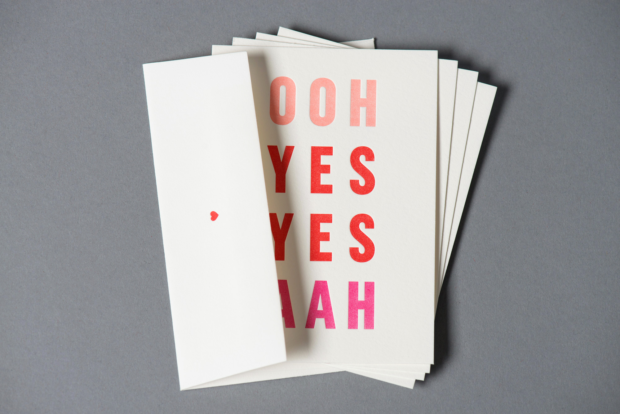
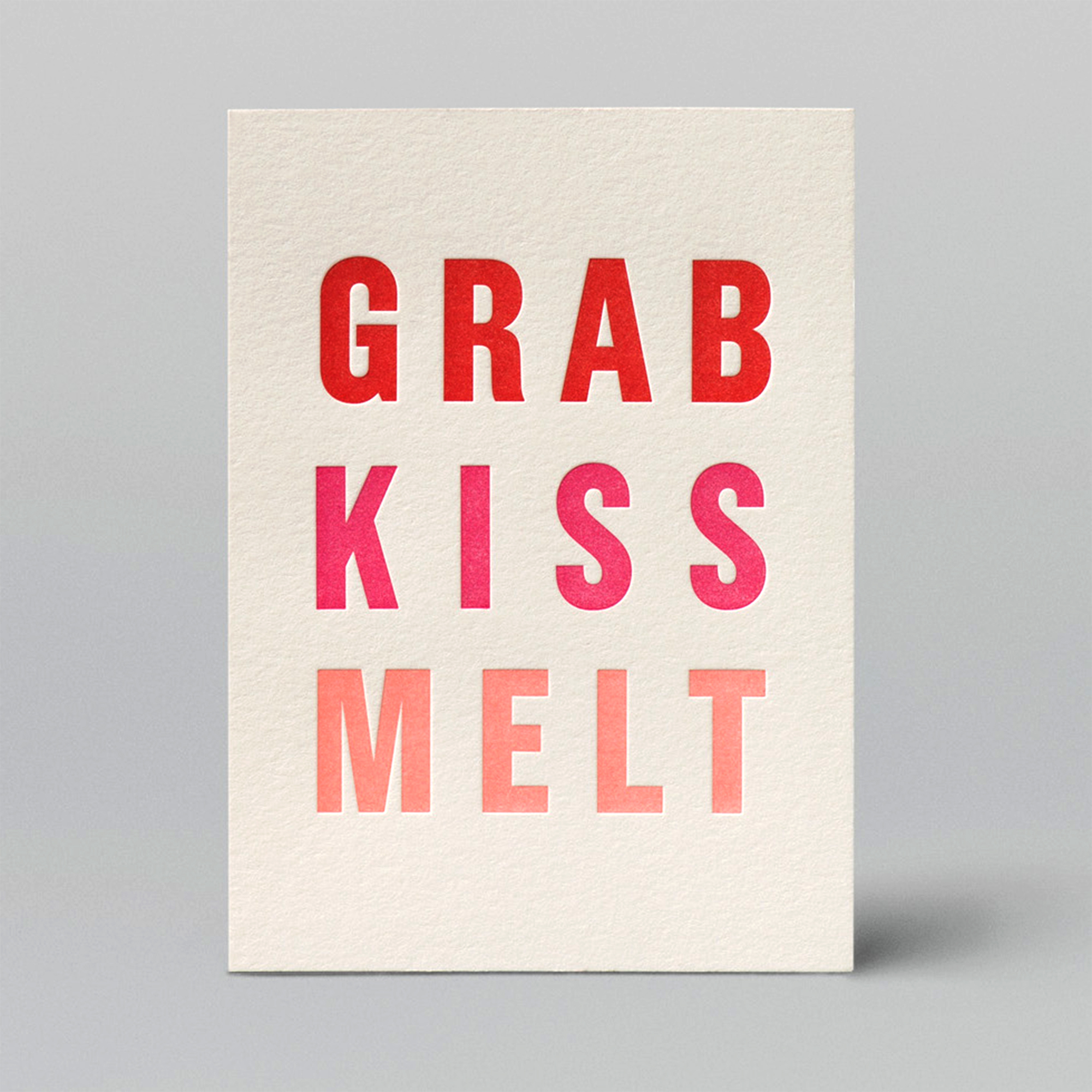
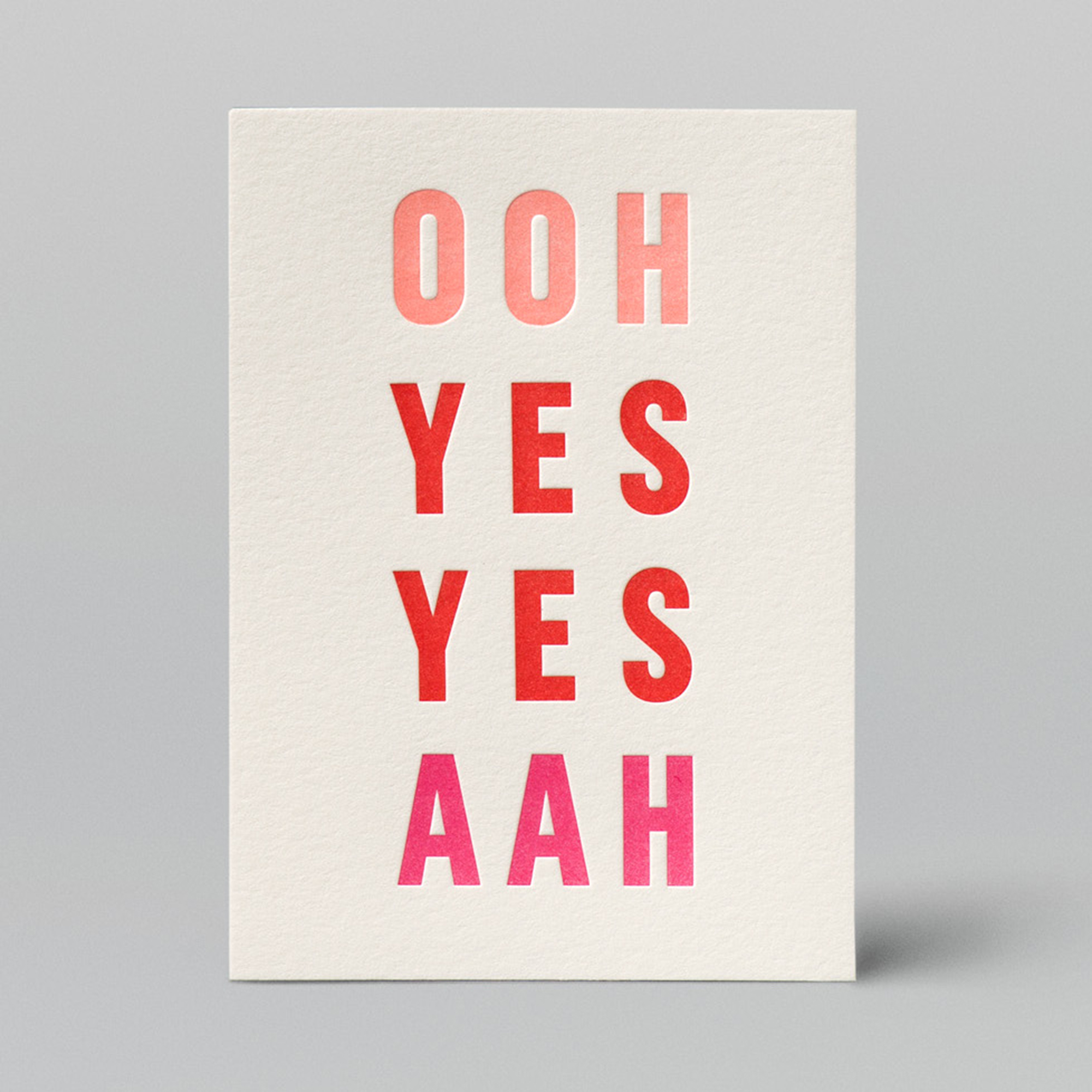
W+K Goodness Letterpress Cards
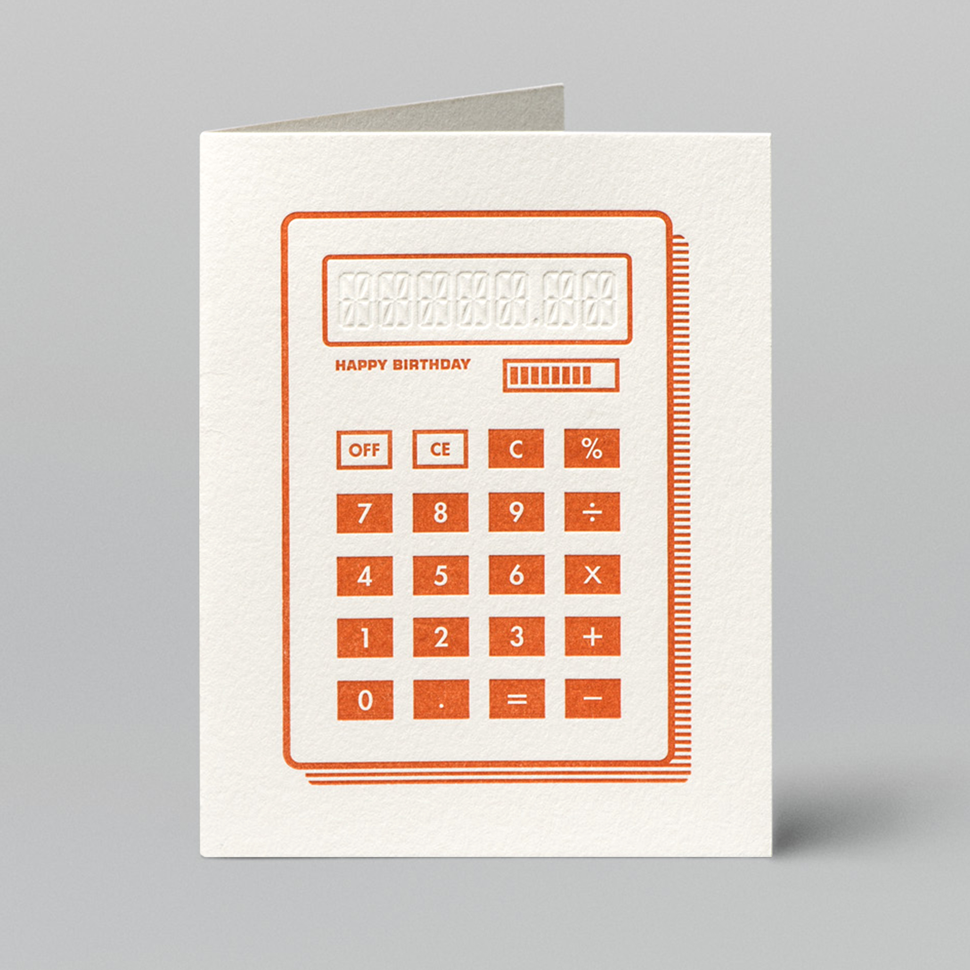
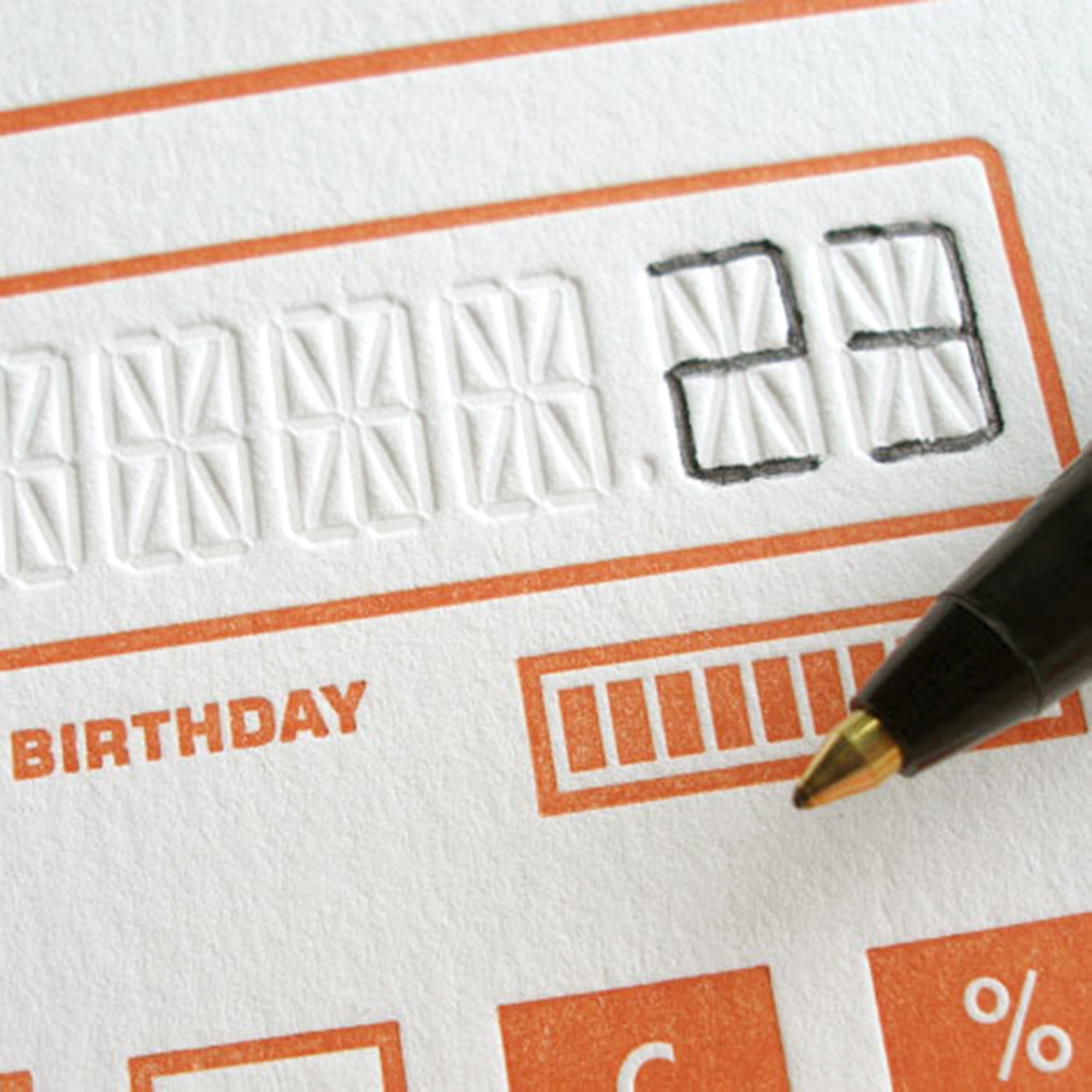
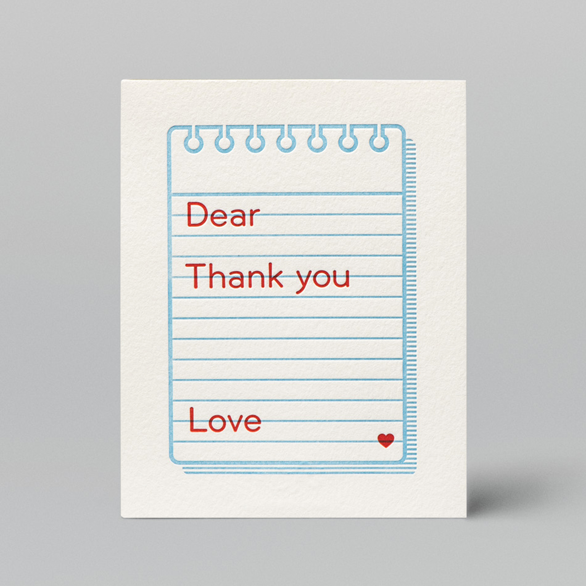
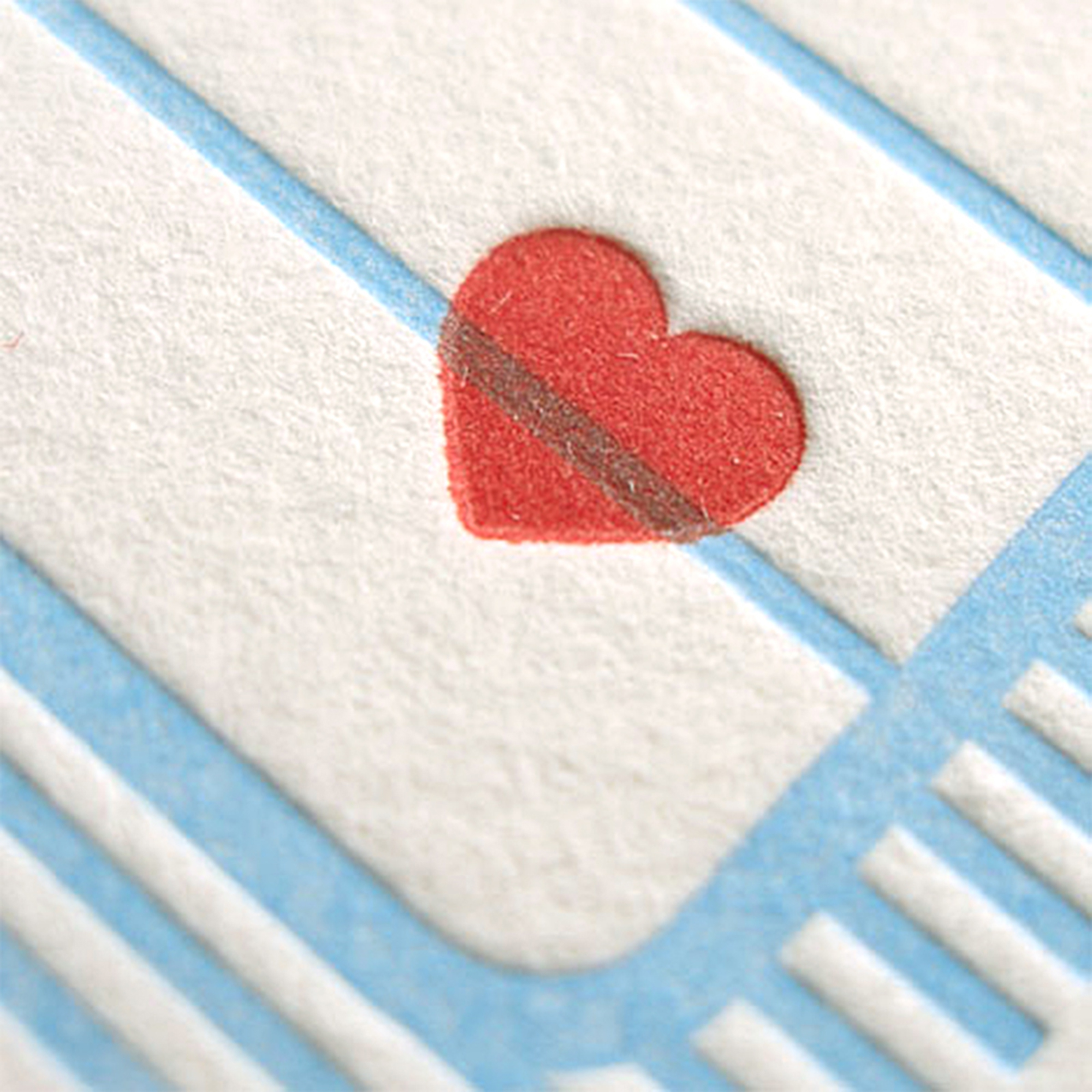
— From 2010 through 2016, I was a core member of the “Goodness” team in the Design Studio of Wieden+Kennedy. Since I have a great love of greeting cards and old-timey correspondence, I always tried to make time outside of client work to propose and execute new designs.
Role: Art Director, Designer, Illustrator, Writer, Production Designer
Other Copywriters: Rebecca Wadlinger, Ellen Osborn, and additional talented writers at W+K
Letterpress Printer: Chelsea Parker Guidry





W+K Goodness Calendars
— Below are designs for various calendar months and covers that were printed by letterpress, silkscreen, or Risograph.
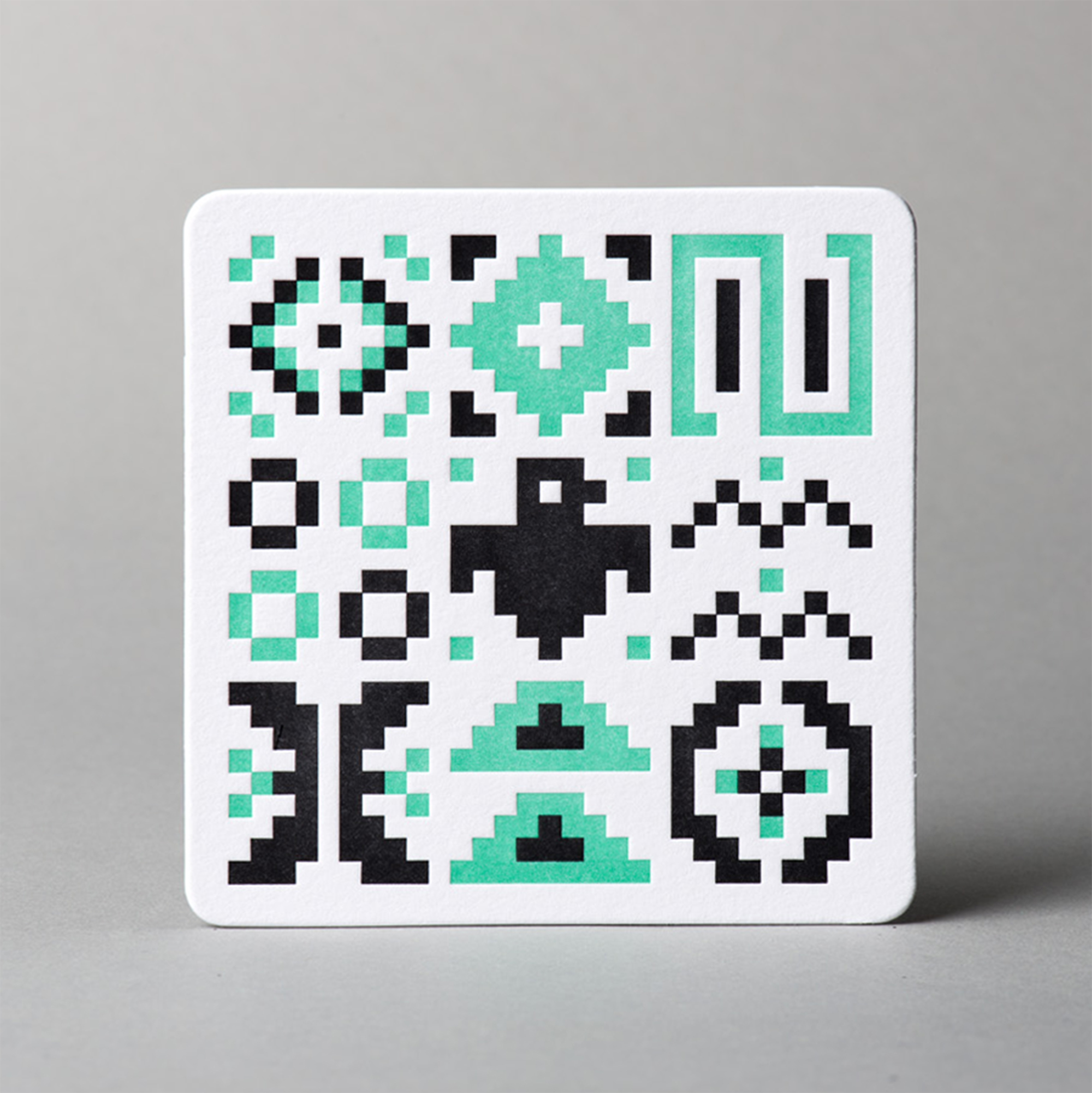


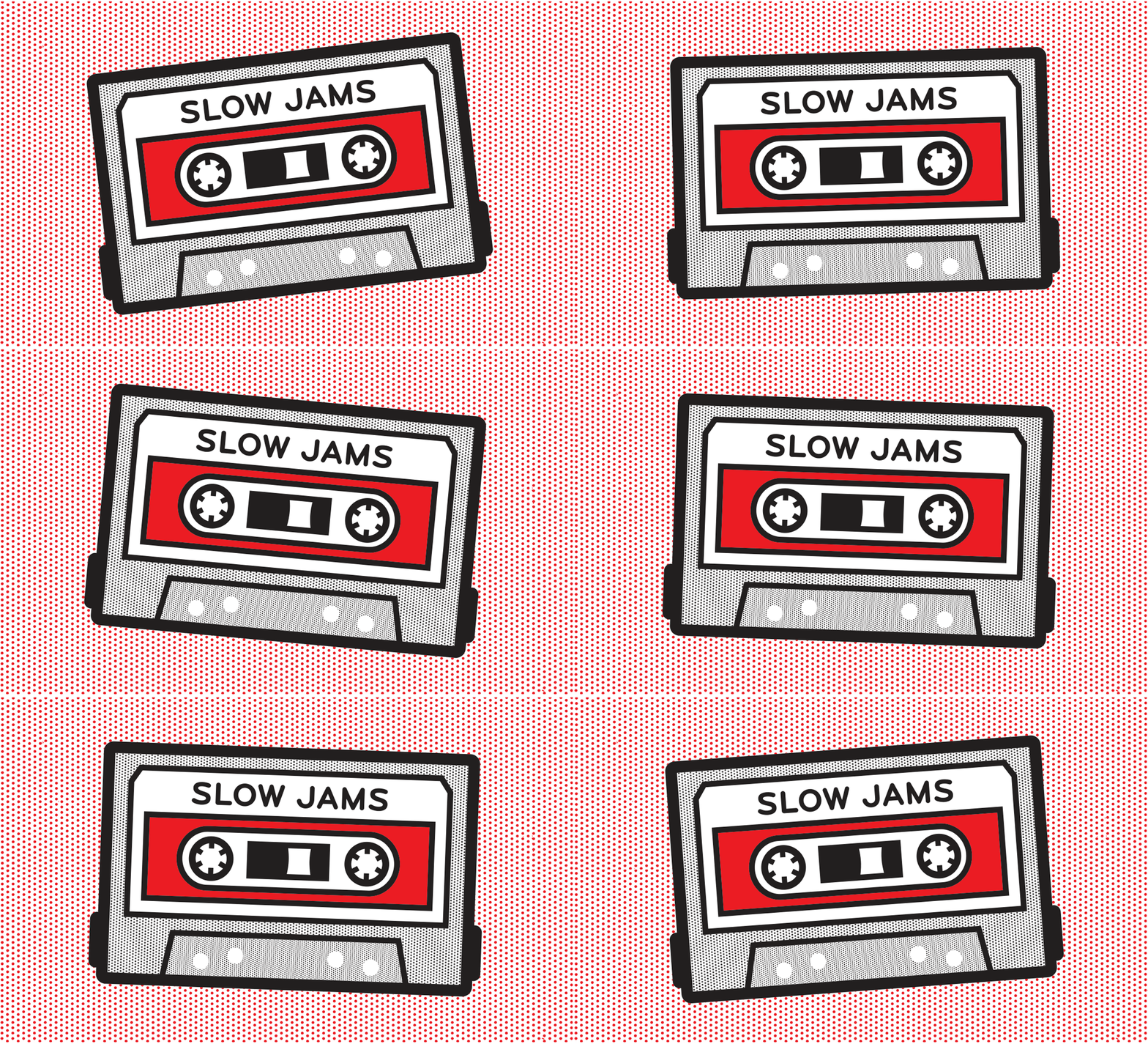
W+K Goodness Animation
— I created the below animation based on a Risograph print that I had made for Goodness.
Chobani Brand Campaign
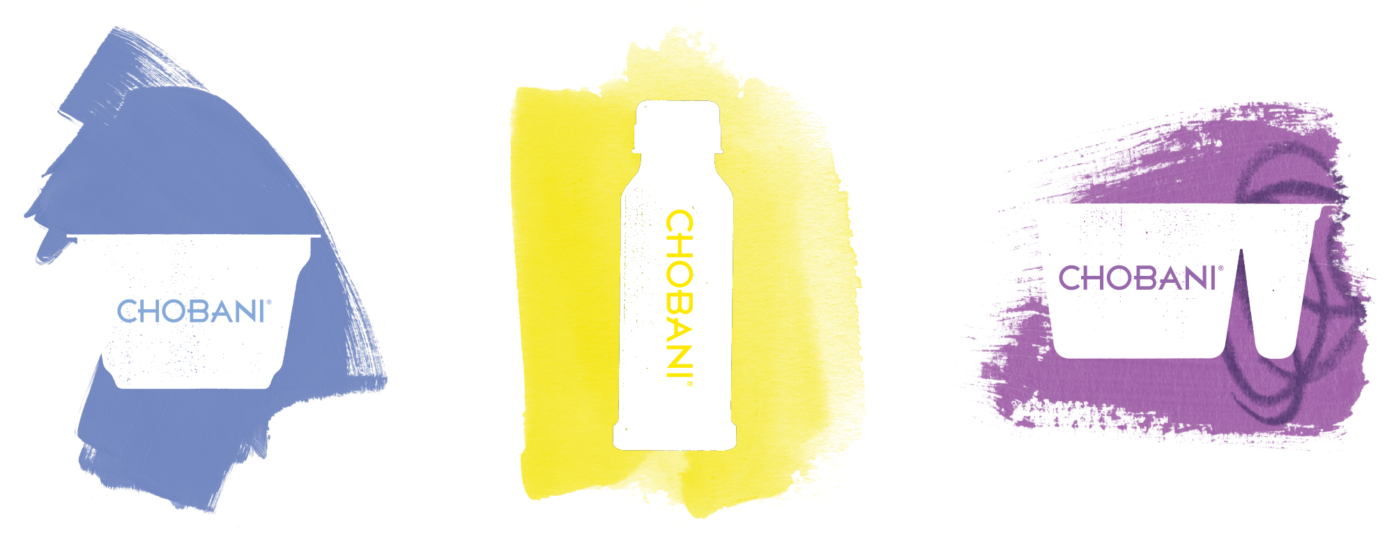
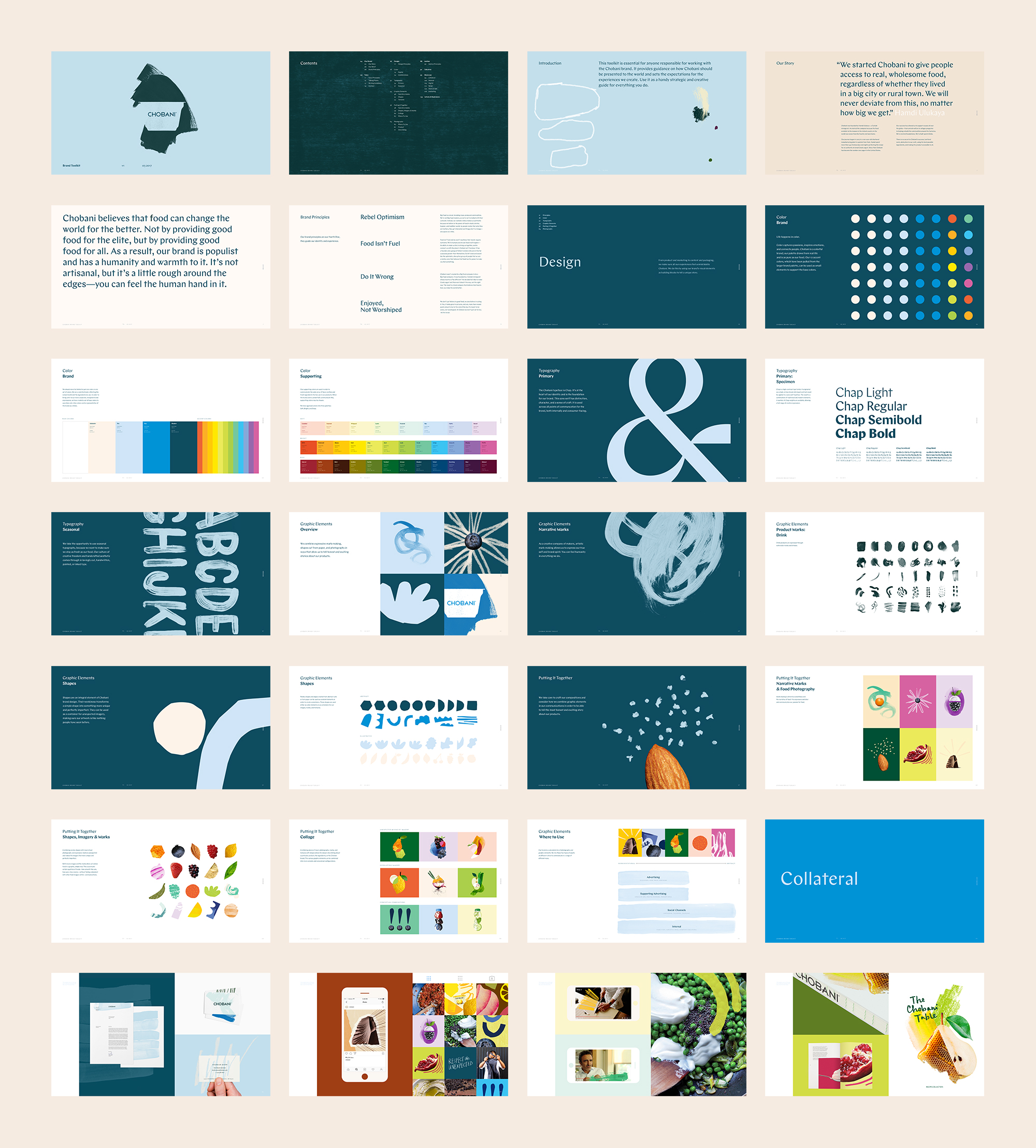
— I worked as part of a team to create a visual identity for a Chobani advertising campaign. We set out to imbue the brand with a rich visual language that was diverse and flexible yet coherent, and one where there was always evidence of humanity and warmth present.
We established a look and feel around the idea of “rebel optimism” and Chobani’s core belief of “good food for all.”
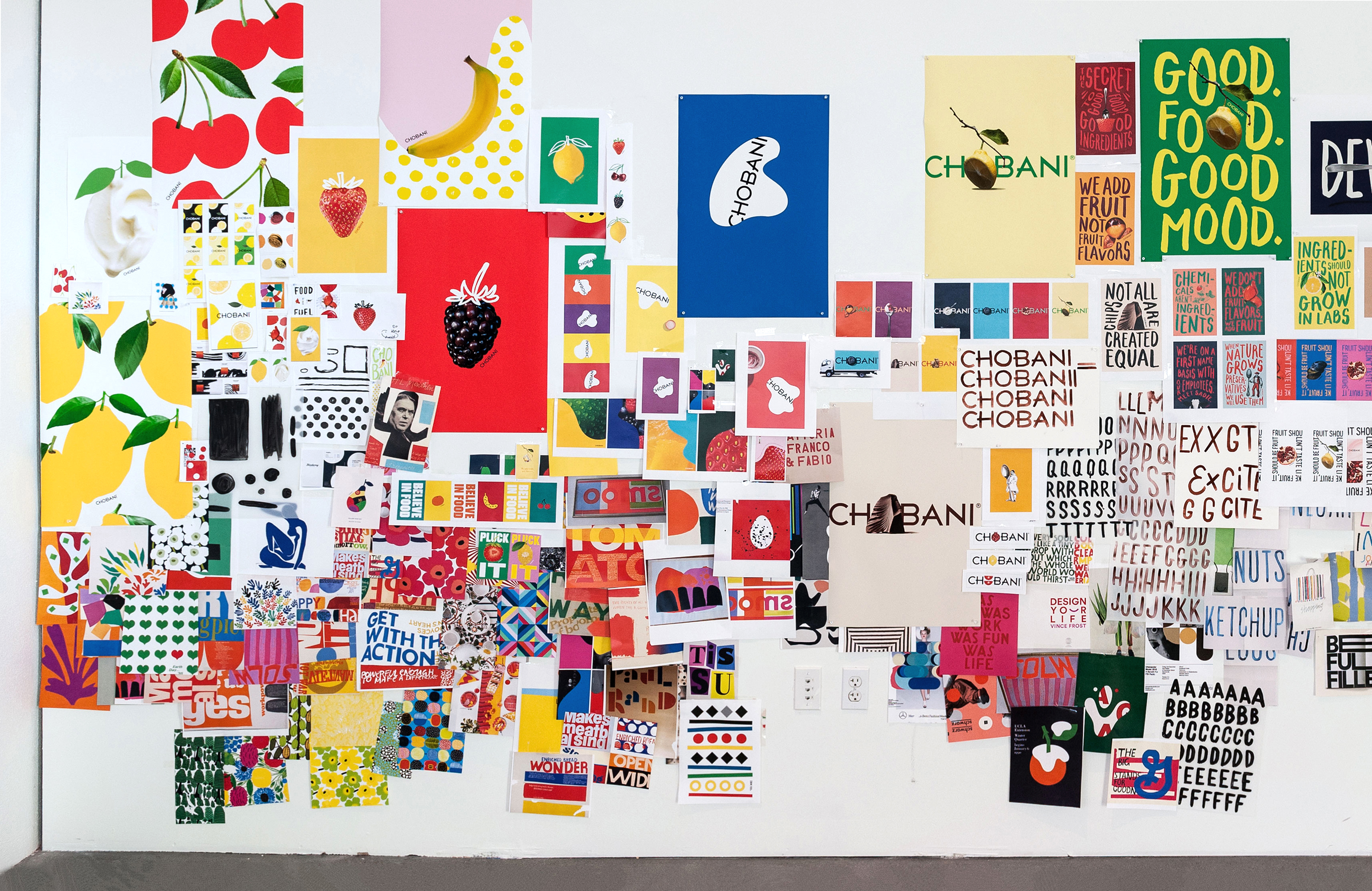
I was involved in all aspects of the project from the beginning including visual research and mood boarding to the design of the comprehensive 137-page brand toolkit deliverable. For each of the client meetings, we created a workshop-like feel to the spaces by covering the walls and tables with mood board images and photography as well as our design explorations in their various phases.
Role: Designer, Illustrator
Other Designers: Lea Loo, Paul Levy, Alex Sanchez, James Aloysius
Design Lead: Sue Murphy
Design Director: Guy Featherstone
Chobani Brand Campaign Visual Explorations
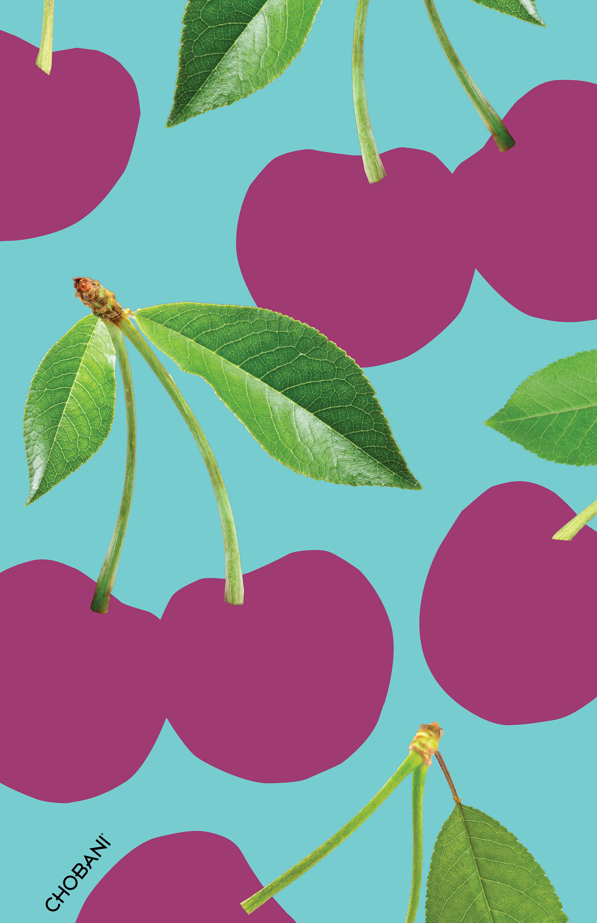
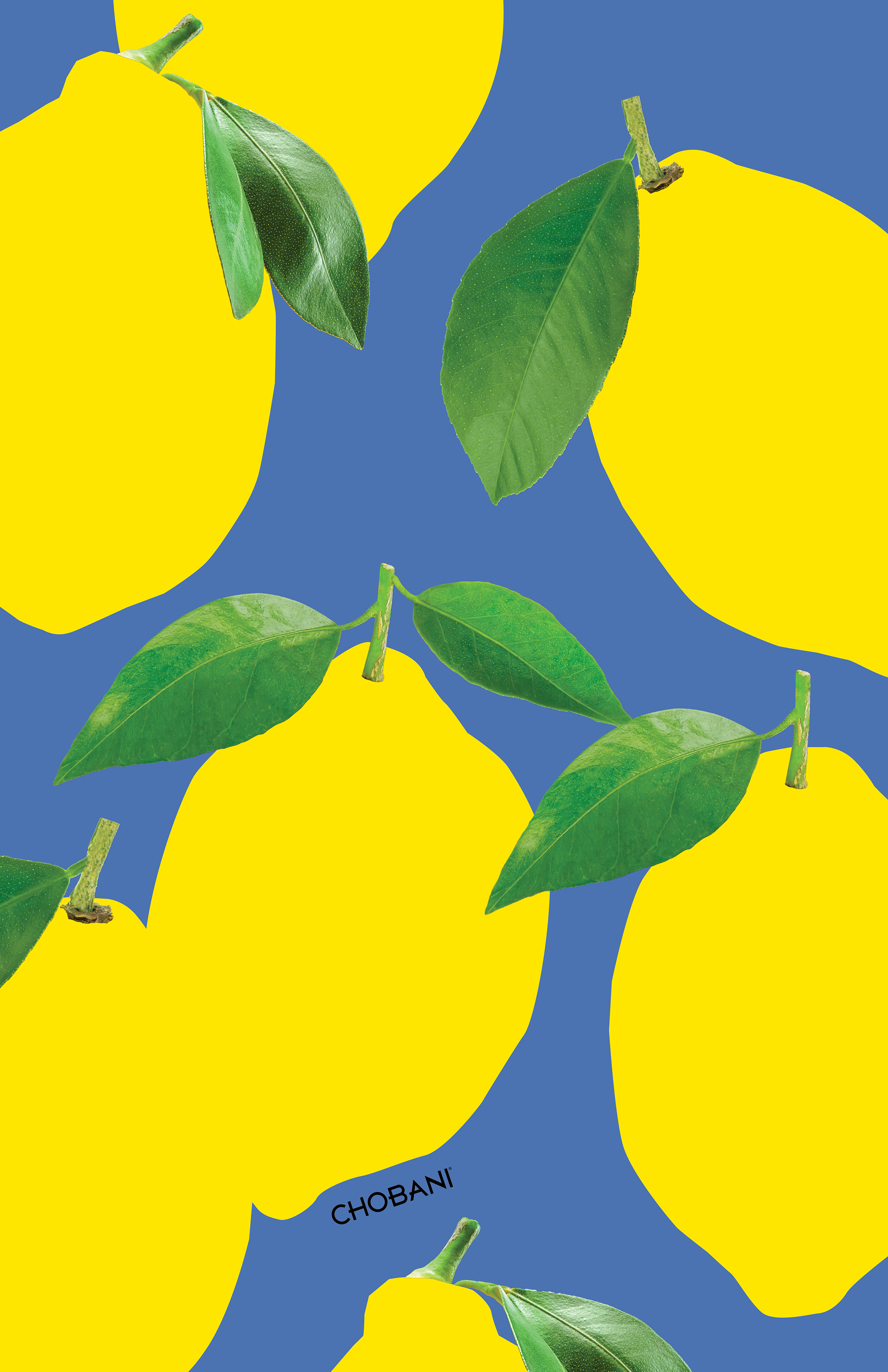
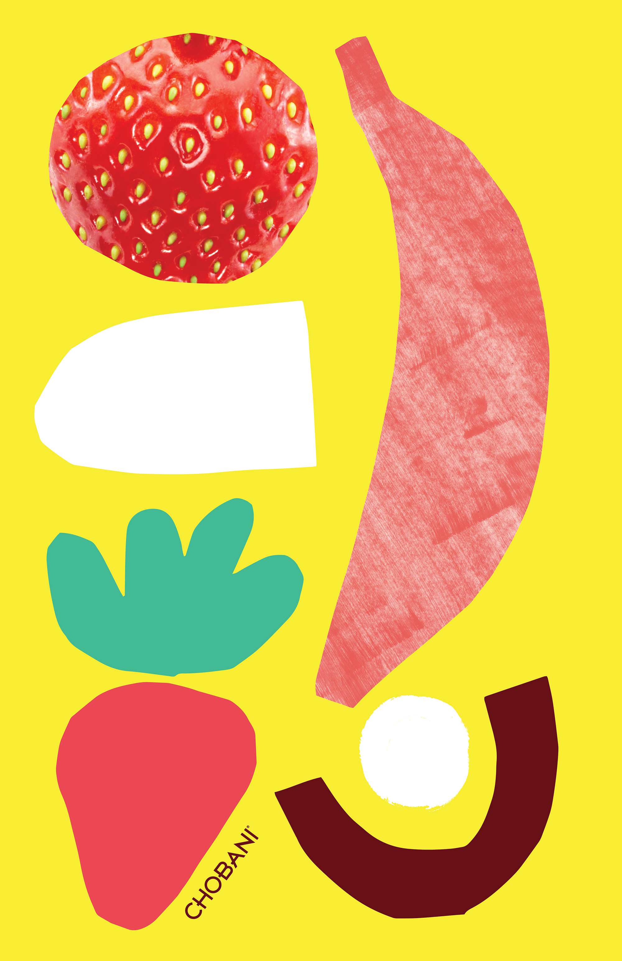
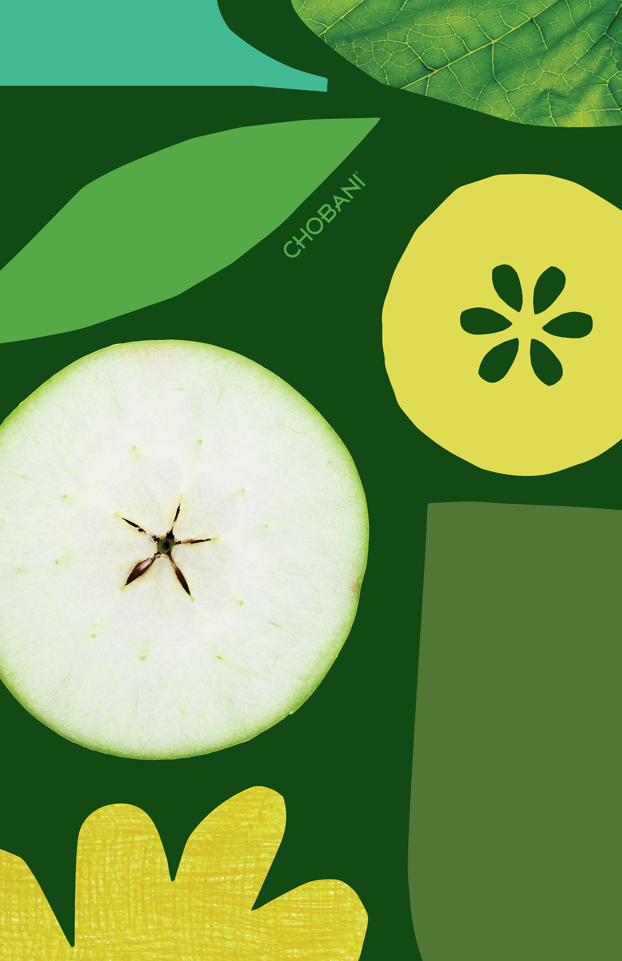
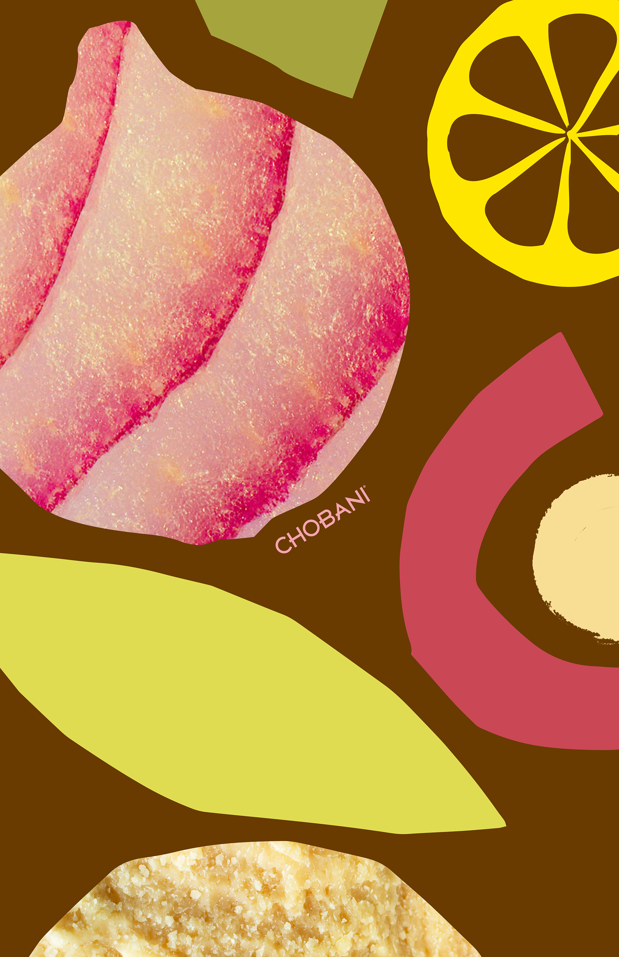
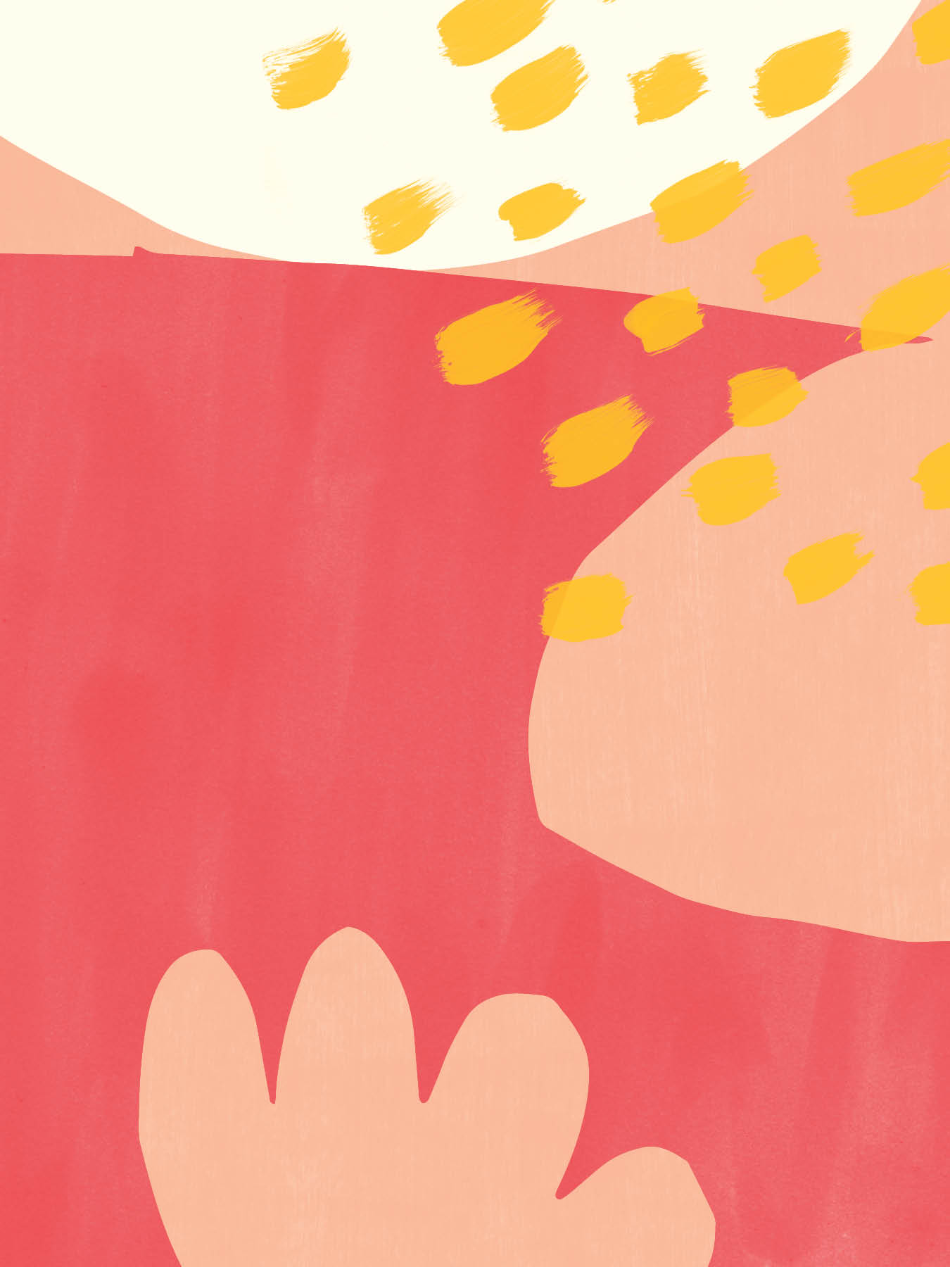
— Through the process, each member of the team created endless design studies that eventually helped to lead us to the final look and feel. During our exploration, I often focused on illustration, pattern, and graphic shapes.

Chobani Recipe Cards
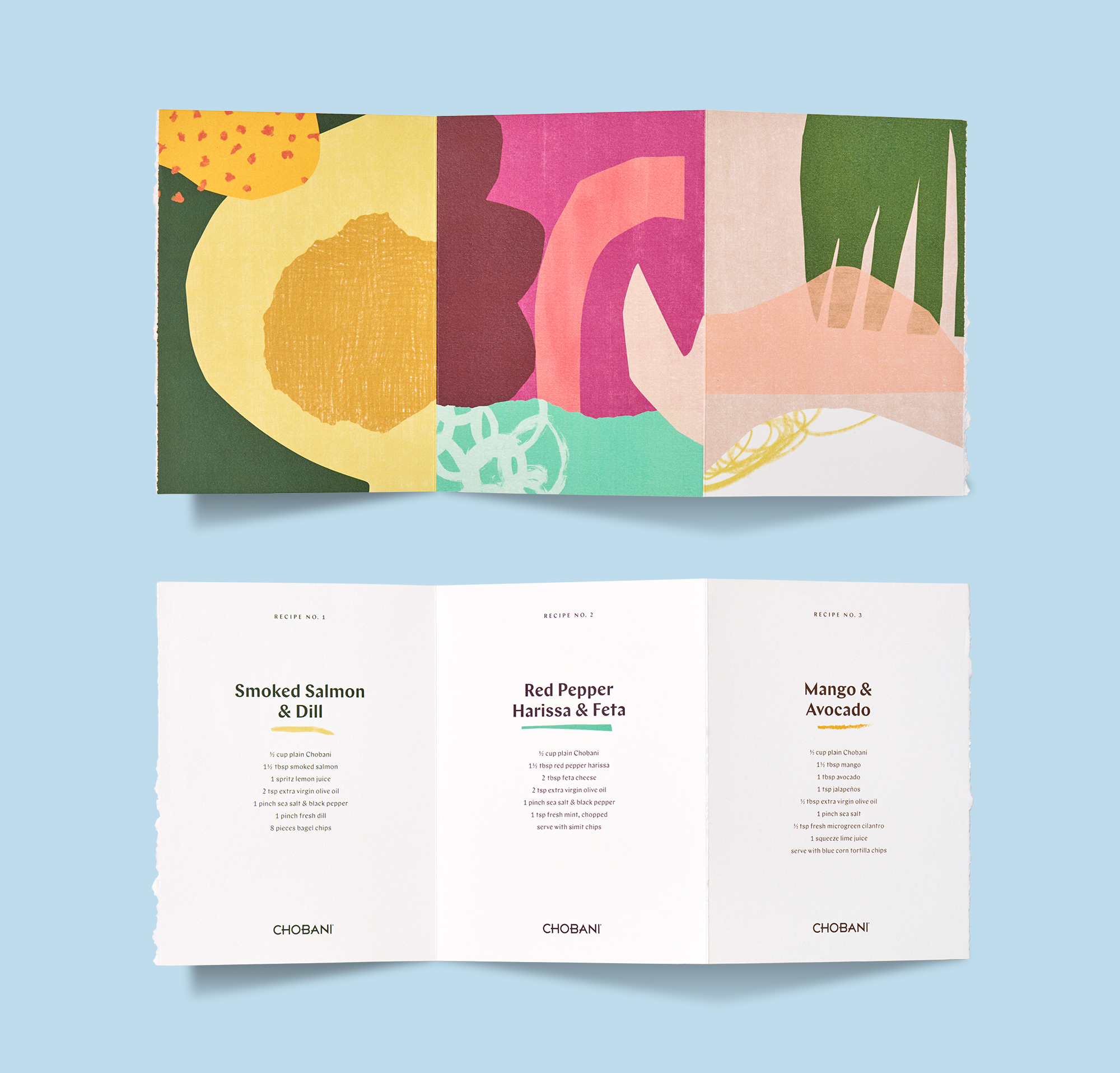
— As an example of how the visual identity could translate into collateral pieces, I designed an accordian-fold booklet with perforated recipe cards.


Chobani Brand Toolkit
— At the end of the project, we gave the client an extensive brand toolkit as well as a large digital asset library that they could use for their brand campaign.
TedX Portland Brand Identity
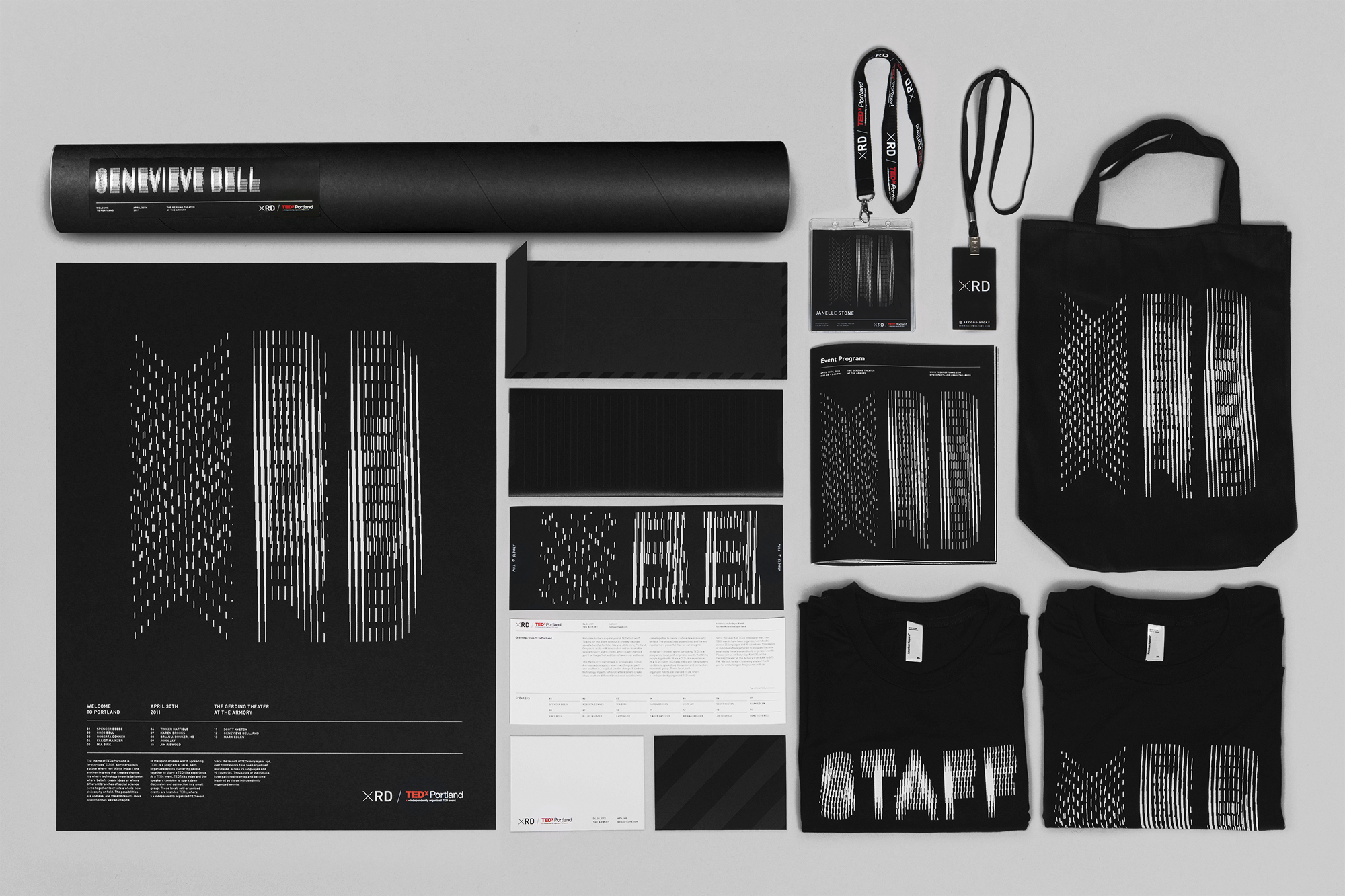
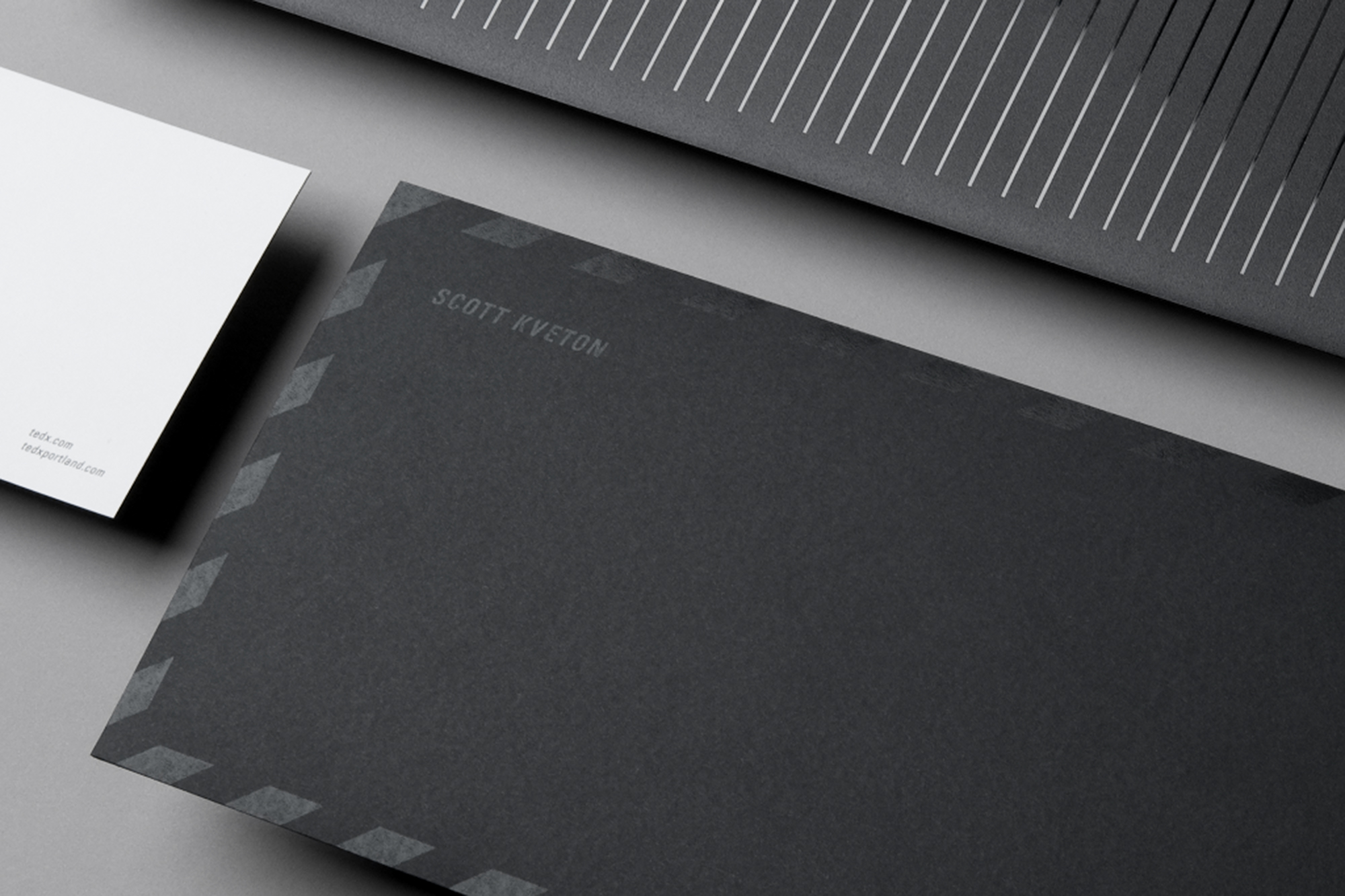
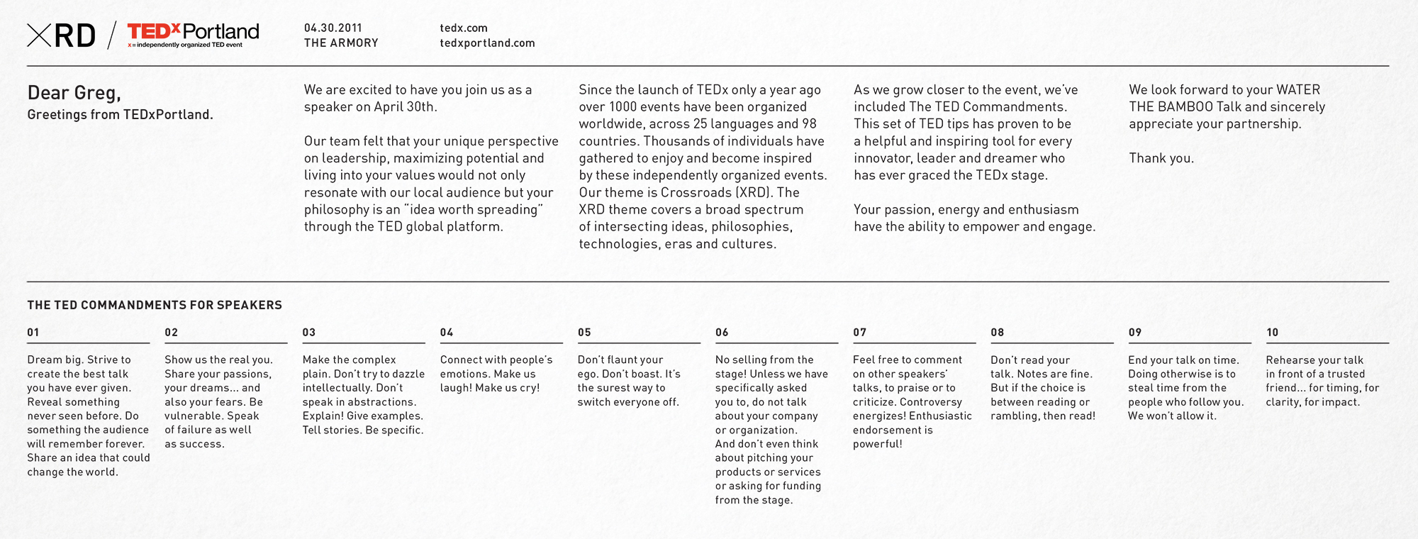
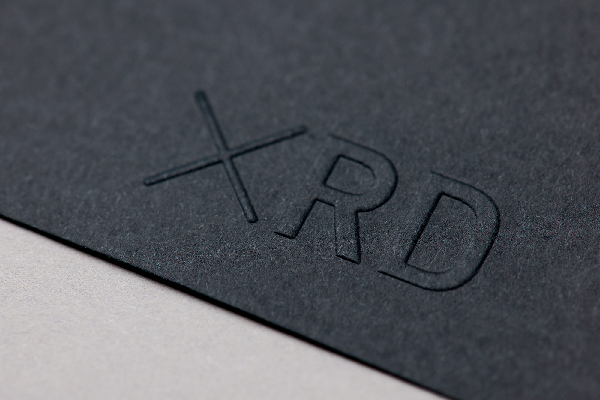
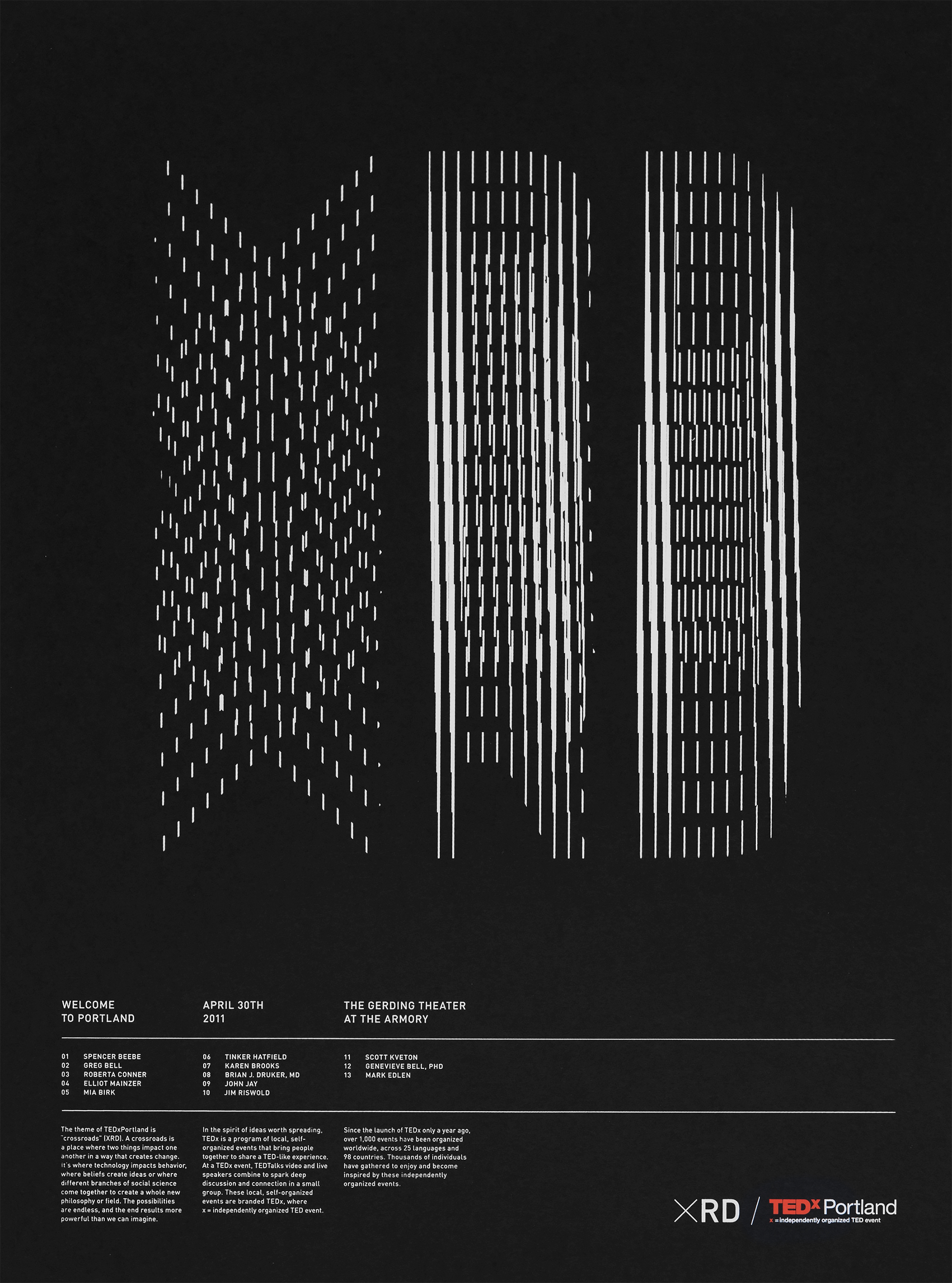
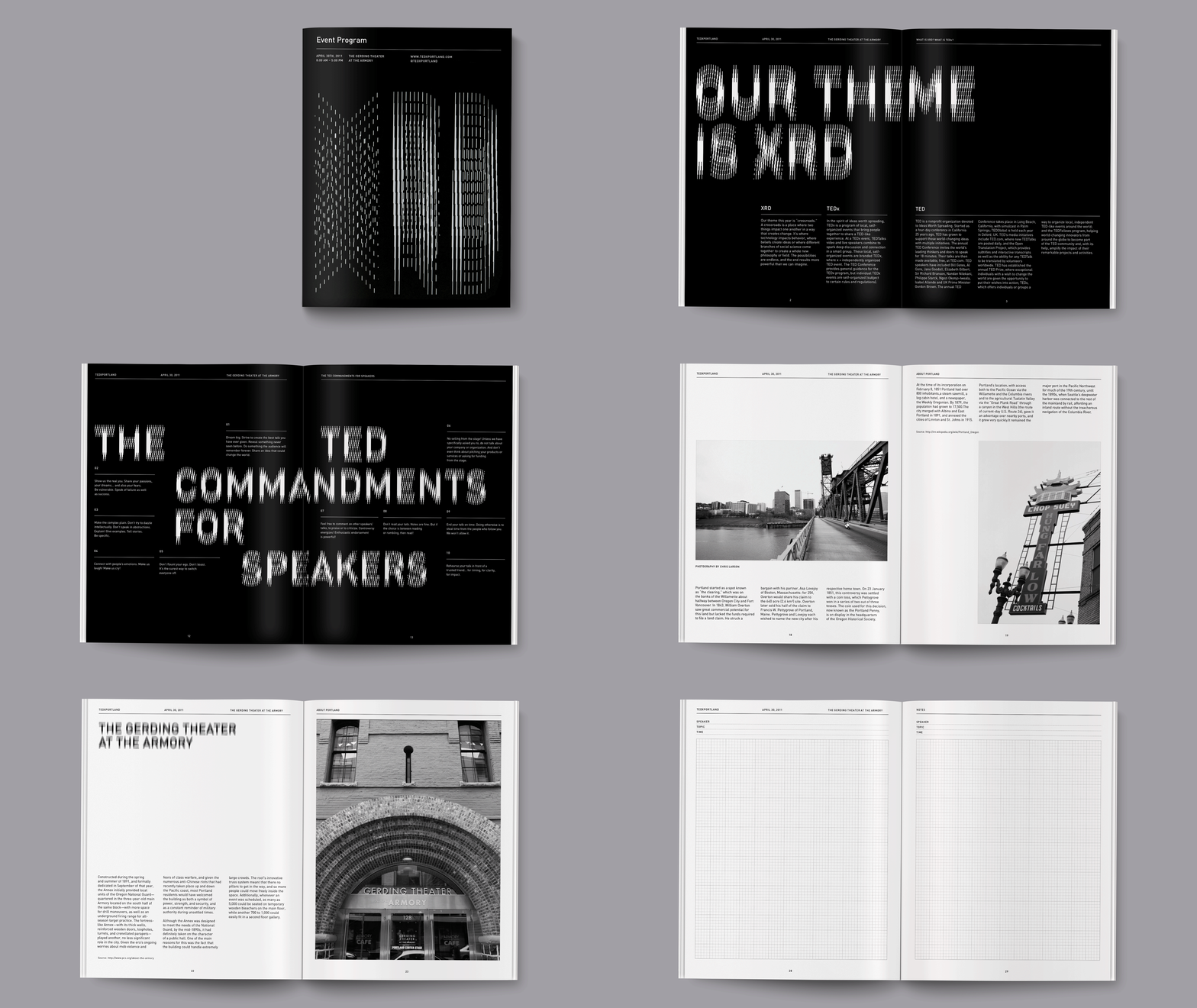
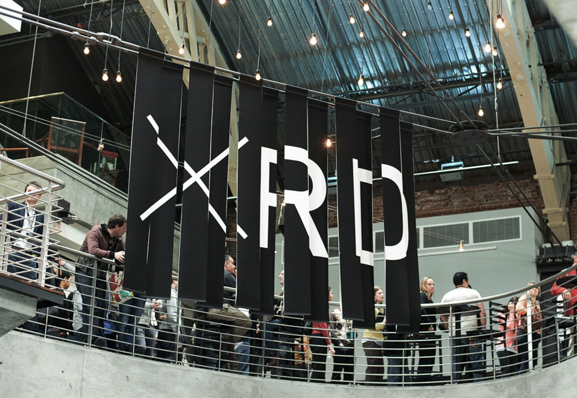
— I worked on a team that created the branding for the first TedX Portland event in 2011. The event’s producers came to us with the theme “crossroads” and thus XRD mark was born.
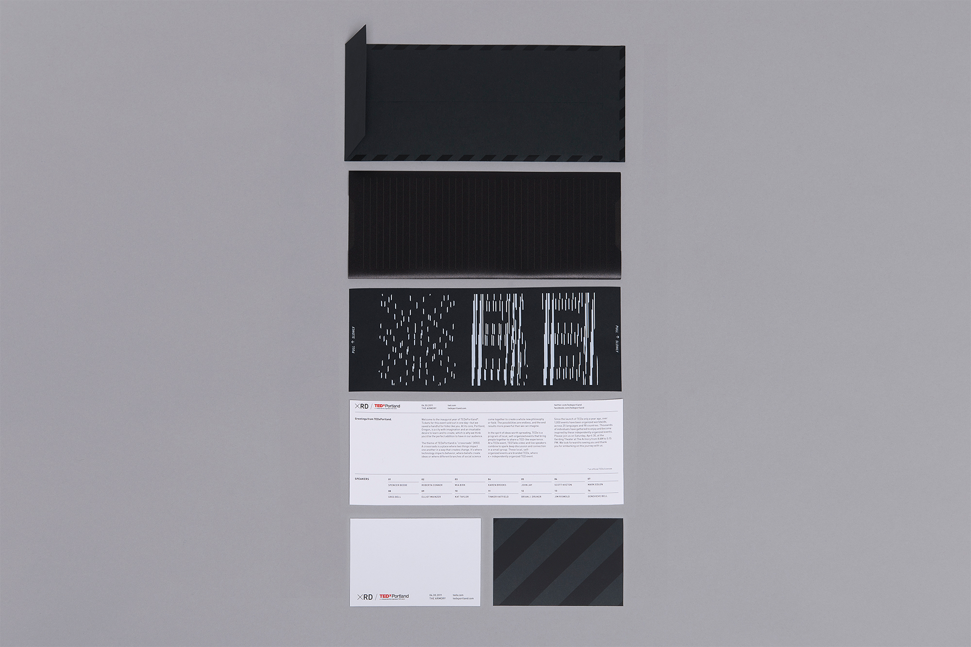
We wanted to create a special moment when speakers received their invitation for the event. We also wanted to reinforce the concept of using intersecting lines to create a “visual crossroad.” The result was a lenticular-based invitation that created an analog animation as the card is pulled from its outer sleeve. Our main goal throughout this project was to create an experience that went beyond just logo applications. The adaptability and versatility of the lenticular aesthetic we developed allowed us to easily translate it into different mediums ranging from print to interactive and motion design.
Role: Designer, Production Designer
Other Designers: Derek Kim, Ken Berg, Steve Denekas



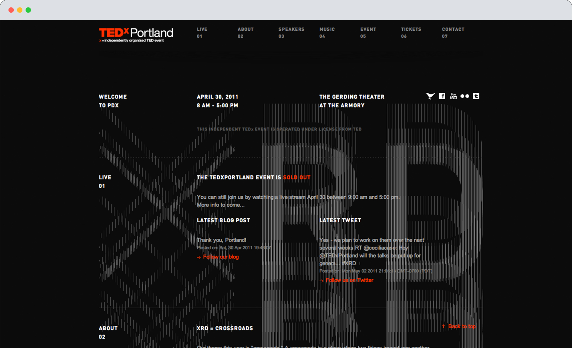
TedX Portland Website
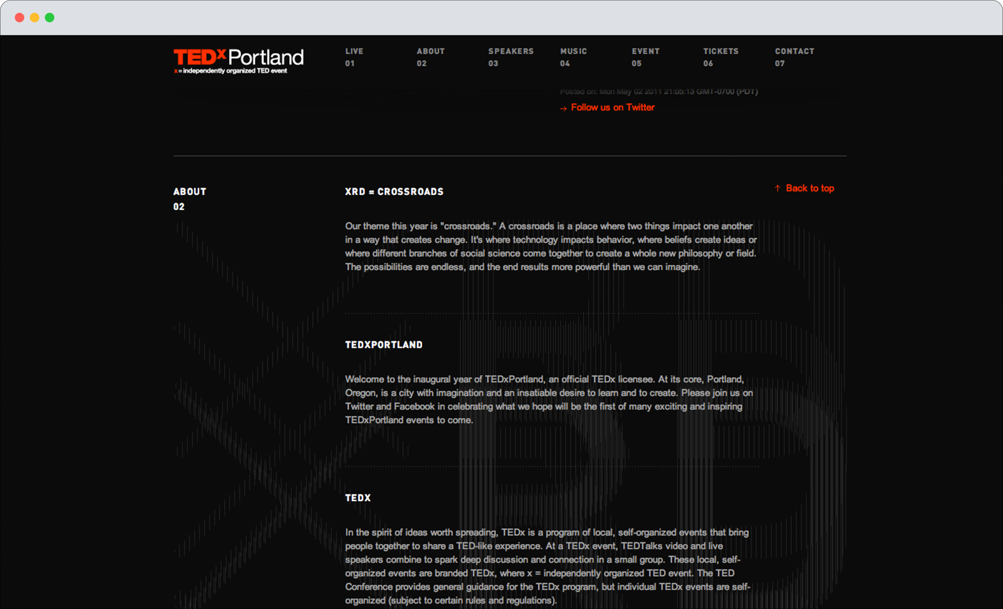
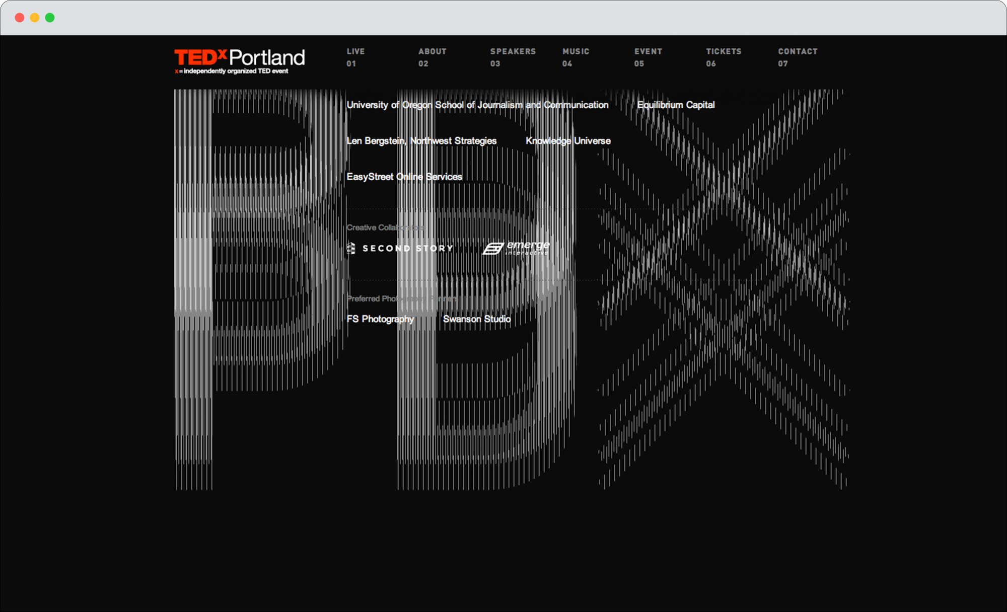
— A few of W+K Studio’s digital designers helped us to translate our lenticular aesthetic of the print collateral to the website by using a parallax technique. As the user scrolls down the page, they are able to break apart the XRD logotype in a manner that reflects the treatment and movement of rest of the identity, and it eventually transforms into PDX.
Digital Designers: Dom Murphy, Pete Hensing, Josh Perez, Mirtho Prepont



Chiquita Brand Book
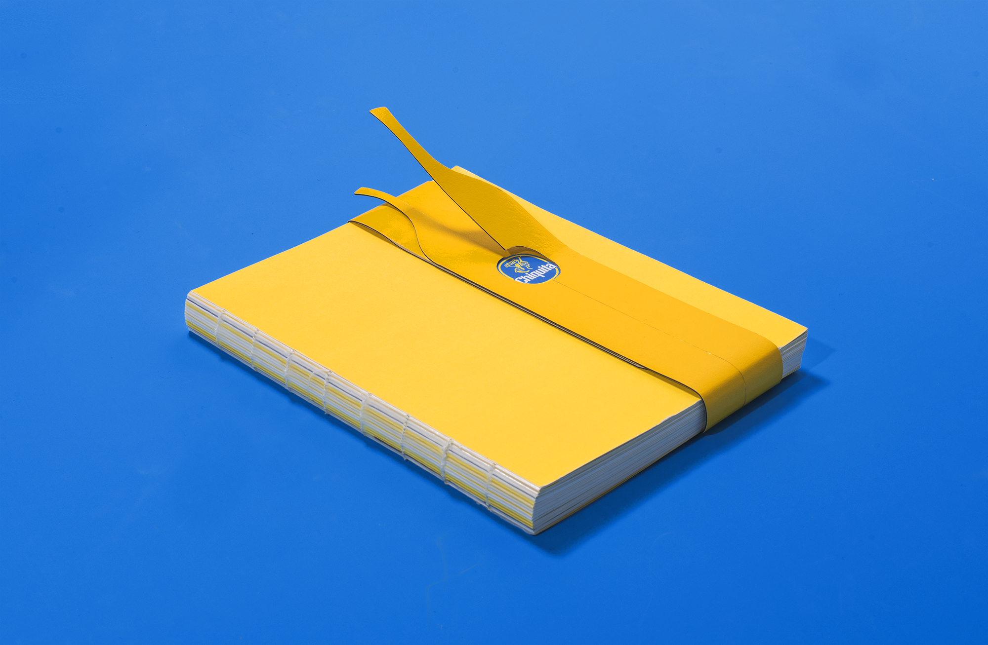
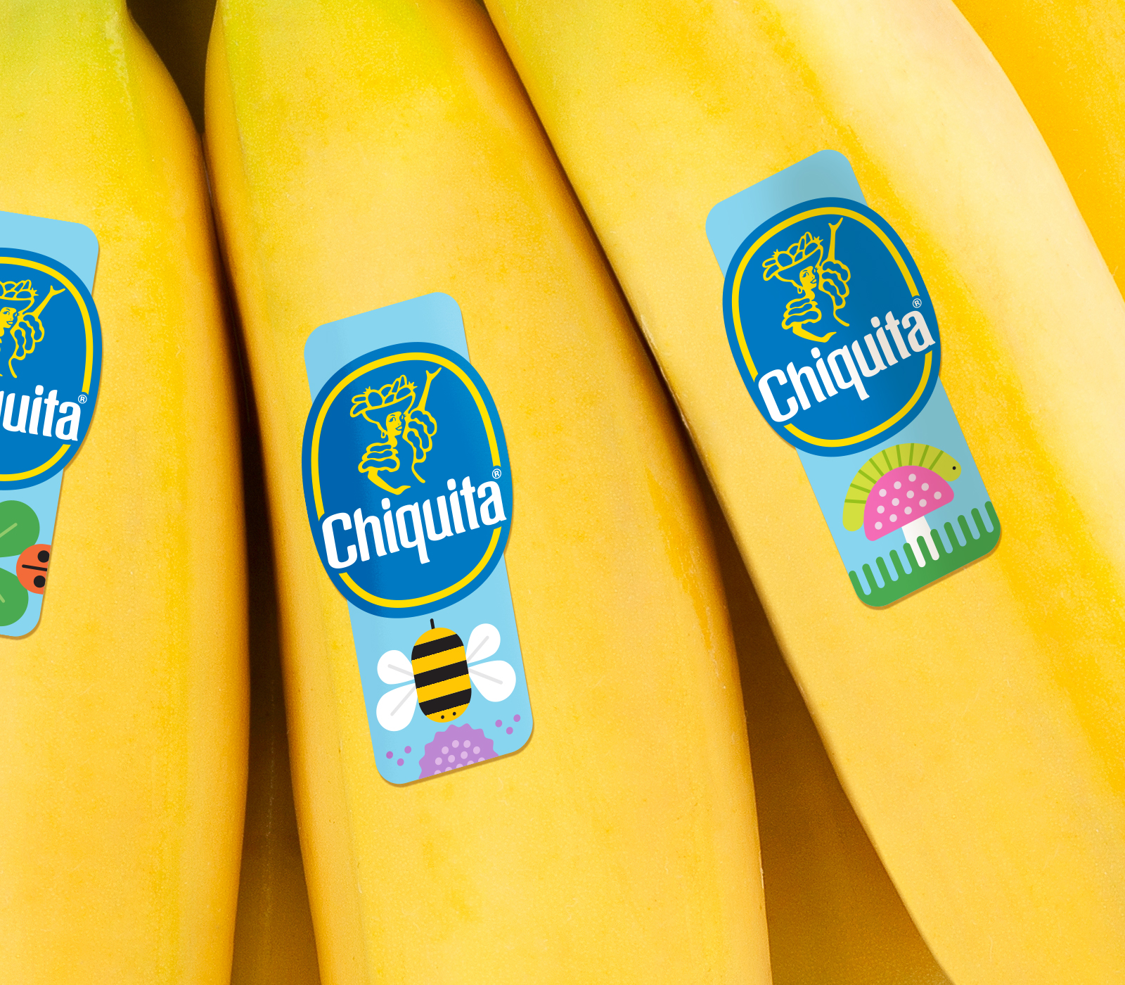
— The client approached W+K Design for an overall refresh of their brand. The goal of the team was to create a playful identity that conveyed that Chiquita bananas are iconic, bold, optimistic, healthy, delicious, and most importantly, fun. I joined the design team to create the Chiquita brand book and also to work on some in-store shelf concepts to display the product.
Role: Designer
Other Designers: Lea Loo, Dee Mahon, Julia Perry, Dave Chathas
Design Lead: Mike Weihs
Design Director: Guy Featherstone
Chiquita Shelf Concepts
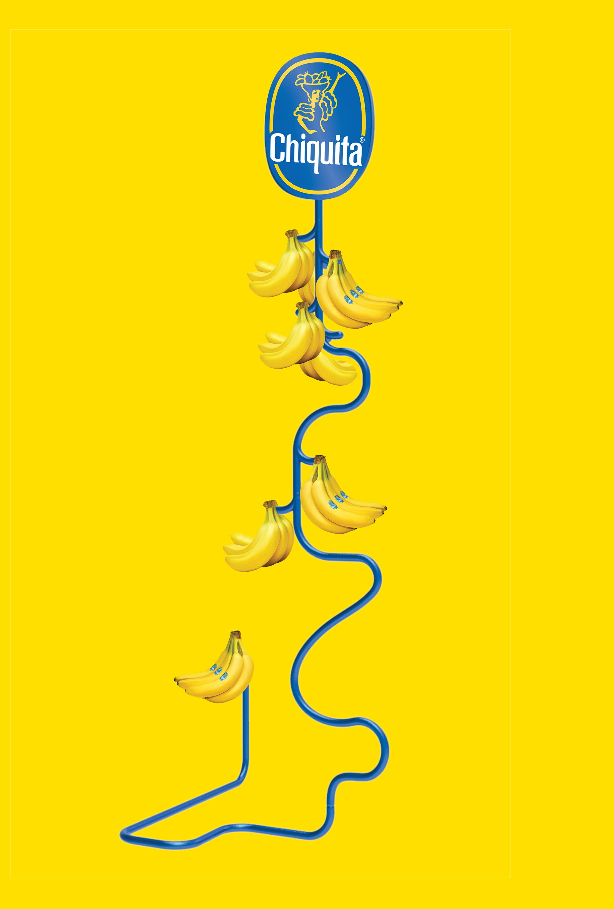
— As a part of the Chiquita branding refresh, I created some in-store shelf concepts and banana hangers that would display the bananas in various playful, unexpected, and modern ways.
